Microsoft Clarity Heatmaps: How to Read Them on Product, Category and Cart Pages
How to set up Microsoft Clarity on Shopify or WooCommerce, read click and scroll heatmaps, and spot what stops shoppers on product, category and cart pages.
GA4 can tell you that most mobile visitors left a product page. It can't tell you whether they missed the price, tapped a photo that wouldn't zoom, or went looking for the shipping cost. A Microsoft Clarity heatmap shows where taps land and where scrolling stops on the page itself, and Clarity's recordings show what individual shoppers did next. Both cost nothing.
This guide sets Clarity up on Shopify or WooCommerce and explains the consent settings that change what it records. Then it reads click and page type by page type: product, category and cart. The generic dashboard tour is left out. The page-type advice leans on Baymard and Nielsen Norman Group research. More figures from that research, grouped by topic, are in the ecommerce statistics we collect. In NN/g's 2018 desktop eyetracking study, users spent around 57% of their viewing time (NN/g). A heatmap tells you what sits in that zone on your own store.
The short version of reading one: start with the device most of your visitors use, group pages by template, and read the ranked list of tapped elements before the colors. On a scroll map, anything below the 50% line was seen by fewer than half of your visitors.
What Microsoft Clarity records, and why it's free
Clarity is Microsoft's behavior analytics tool. It records sessions, builds click and scroll from them, and flags frustration signals such as rage clicks, dead clicks and quick backs on a dashboard. Newer features add AI summaries of heatmaps and recordings.
The pricing page says it's free, and Microsoft explains the trade: the data helps improve the machine learning models behind its products. Read the terms before you install it. The Clarity terms make you and Microsoft independent controllers of the data and allow Microsoft to use it for purposes that include advertising and AI training. Your privacy notice should name Microsoft Clarity for that reason. The terms also rule Clarity out for content involving health care or financial services. Microsoft's FAQ adds that it shouldn't run on sites aimed at under-18s, which matters if your store handles health or financial information, or targets teenagers.
Clarity doesn't sample your traffic, but it does have hard caps. Microsoft's FAQ lists up to 100,000 recorded sessions per project per day and up to 100,000 page views per heatmap. Retention differs by data type:
- Recordings — kept 30 days, then a sample of 1% or 10 per day (whichever is higher) plus your favorites for up to 9 months (Microsoft Learn)
- Heatmaps — kept 9 months (data retention)
You sign in with a Microsoft, Google or Facebook account, so no Microsoft 365 plan is involved. As for whether it's any good, the official Shopify app holds around 4.6 out of 5 from over 2,200 reviews on the Shopify App Store.
How to set up Microsoft Clarity on Shopify and WooCommerce
Both platforms have an official route. Use the official app or plugin rather than pasting the tracking code by hand, because it doesn't depend on edits to your theme files and, on Shopify, handles consent. Microsoft still suggests confirming the script after you switch themes.
Clarity on Shopify
Microsoft documents the Shopify app as the install path (Microsoft Learn):
- Open the Shopify App Store, search for Microsoft Clarity and select Install.
- Review the permissions and confirm the install.
- Select Go to app settings, check that the Clarity JS toggle is on (newer docs call it Clarity Script) and save.
- Give the dashboard a few hours to fill with data.
If you added Clarity to theme.liquid years ago, the app migrates that project without code changes. Link it with Connect Project (called Link my existing Clarity project in newer docs) instead of creating a new one.
Don't expect checkout recordings on a standard Shopify plan. Microsoft states that checkout and post-checkout pages are tracked for Shopify Plus stores through Shopify's pixel. Shopify limits the advanced DOM events that replay tools need on checkout to Plus, so on other plans your recordings stop when the shopper enters checkout. A custom pixel doesn't get around this, and it can't produce heatmaps at all.
Clarity on WooCommerce
Microsoft has one official WordPress plugin, and it covers WooCommerce stores (Microsoft Learn):
- In WordPress, go to Plugins > Add New and search for Microsoft Clarity.
- Select Install Now, then Activate.
- Sign in on the Clarity screen and pick an existing project or create a new one.
The plugin loads Clarity for every visitor and doesn't check consent on its own. Pair it with a consent tool that passes Clarity's consent signal. Microsoft names CookieYes in its cookie consent docs, and Google Consent Mode works too. By default, the latest plugin also sends server-side request logs to Clarity for its Bot Activity report, so review and disclose that collection as well.
The European consent change that splits your sessions
Since 31 October 2025, Clarity needs a consent signal for visitors from the EEA, the UK and Switzerland. Without one, Clarity runs without cookies. Each page view then becomes its own session, quick backs read as zero and funnels look like everyone left after one page (Microsoft Learn).
The symptoms are easy to spot. sits close to 1, and your own domain shows up among the top referrers, because every internal click starts a "new" session. Heatmaps are built from page views, so they hold up better than session metrics, though Microsoft warns that without consent even heatmaps and recordings may be incomplete.
On Shopify, Microsoft says Clarity picks up consent from Shopify's own cookie banner. Shopify's automated banner covers the UK and EEA, so add Switzerland under the banner's regions in Settings > Customer privacy if you sell there (Shopify Help Center). On WooCommerce, the consent tool has to call Clarity's consent API or pass the signal through Google Consent Mode.
Do you need consent to use Clarity? The UK's ICO and France's CNIL have both addressed session recording directly, and both treat it as needing consent. The ICO lists recordings of individual visitors among uses that need it, and the CNIL published a draft recommendation on session replay in 2026 that points the same way. The draft also asks for more, such as masking by default and short retention.
Consent also covers more than cookies. Without it, Clarity keeps collecting page views and interactions in cookieless mode. The EU's data protection board treats scripts that send data from the browser as covered by the same consent rule as cookies (EDPB Guidelines 2/2023). The cautious setup loads Clarity only after a visitor accepts. How you do that depends on your consent tool: many WordPress consent plugins can hold a script back until consent, while on Shopify you'd check whether your consent app can block app scripts.
Pro tip: Check consent in your browser's developer tools, from a European connection or with a consent tool that sends "denied". Decline the banner, reload the page and look for the
_clckand_clskcookies, which shouldn't be there. Accept, reload, and they should appear.
Key takeaway: On European traffic, fix consent before you trust any Clarity number. Missing consent quietly turns every page view into a separate session.
Find conversion blockers before your heatmaps fill up
How to read a Microsoft Clarity heatmap
Clarity offers five heatmap types: click (called tap on mobile), scroll, area, attention and conversion (Microsoft Learn). Click and scroll maps answer most store questions, so start there. Conversion maps need Clarity to detect purchase events (conversion maps). Microsoft's feature page labels them Shopify only while its docs don't, so on WooCommerce check whether your project shows them before you plan around them.
A click map counts clicks per element, not per pixel, and ranks those elements in a side panel with their share of all clicks (click maps). Red means most clicked and blue least (heatmap features). The view menu switches between all clicks, dead clicks, rage clicks, error clicks, and first or last clicks. The ranked list is often more useful than the colors, because it names the element and gives you a number.
A scroll map shows the share of visitors who reached each depth of the page, in 5% steps. It also marks an "average fold" line where the ends (scroll maps). Read it against your layout, and note which blocks sit above the average fold and which sit past the 50% line.
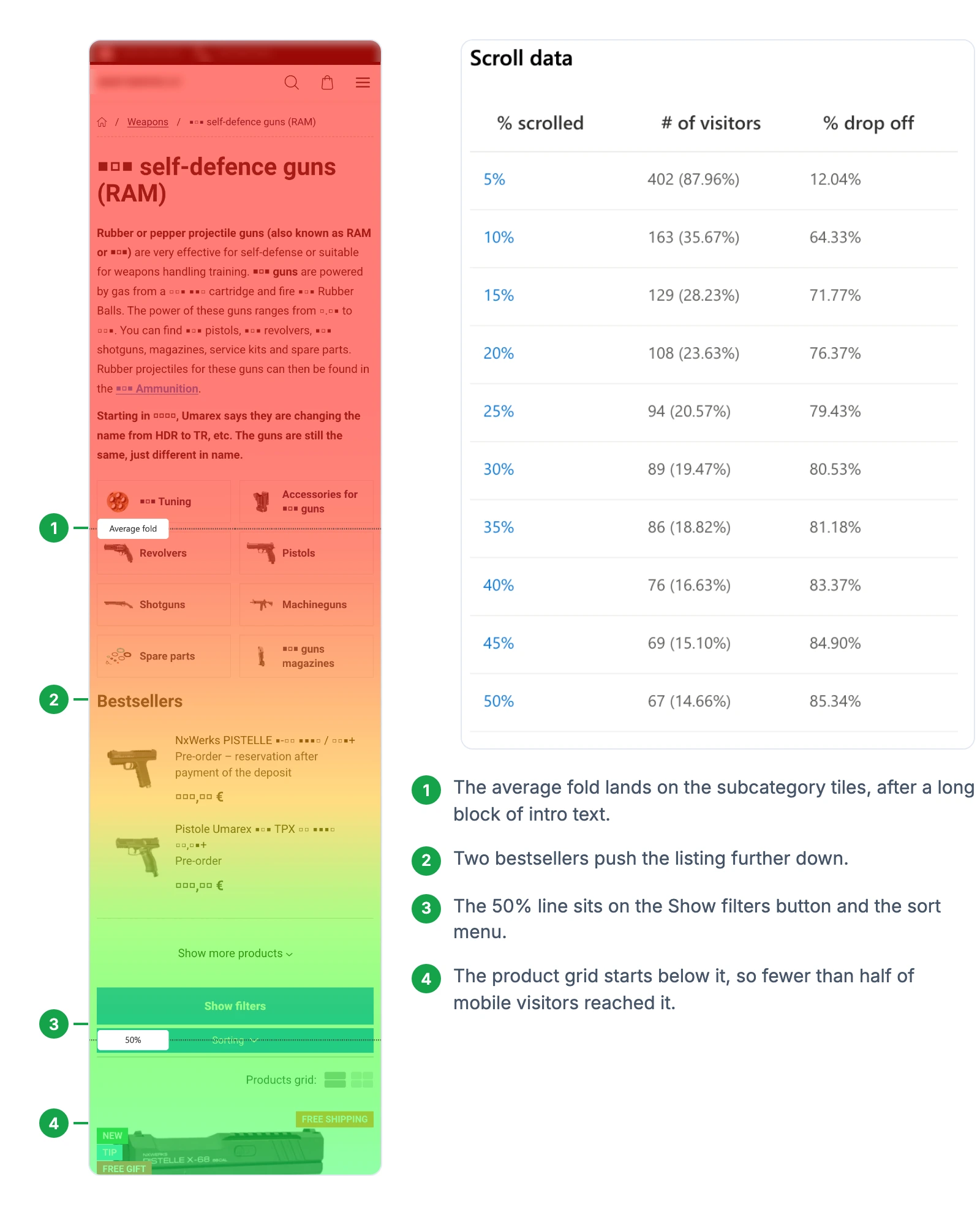
Four settings decide whether a heatmap tells the truth:
- Pick the device first. Clarity's Shopping benchmark puts around 72% of shopping traffic on mobile, but check your own split. Read mobile and desktop separately when both carry real traffic, because the layouts differ.
- Group URLs by template. In the URL filter, use "contains" with
/products/,/collections/or/carton Shopify. WooCommerce defaults to/product/,/product-category/and/cart/, but all three can be renamed, so copy the stable part from a live URL first. Use "matches regex" when you need to combine or exclude patterns, for example to keep product URLs out of a collection group (path filters). Single product URLs rarely have enough traffic, and one visitor can produce a 100% dead-. - Treat the background as a sketch. Clarity lays the heat over a screenshot from one randomly chosen session (Microsoft Learn). Open menus, cart drawers and popups are usually missing. A grouped map can show a different product from the one you expect. The page can also render without its styling when Clarity can't load your site's files (troubleshooting heatmaps). Change screenshot picks another.
- Wait for enough traffic. Microsoft sets no minimum. CXL suggests around 2,000 to 3,000 page views per design screen per device before trusting a click map, so widen the date range on smaller stores.
Masking hides your prices by default. Clarity's default Balanced mode masks numbers, so prices, discounts and totals show up as blank squares in heatmaps and recordings. Form inputs stay masked in every mode (masking). If you need to see prices, unmask those elements with data-clarity-unmask="true" rather than switching the whole site to Relaxed. The change applies only to data collected afterwards and can take up to an hour.
Two more tools save time. Compare puts two heatmaps side by side, which suits before-and-after checks. Summarize heatmaps asks Copilot for a written summary (Microsoft Learn); treat it as a first pass, not a verdict.
Key takeaway: Read heatmaps by page template and device, and confirm anything surprising in a few recordings before you change the page.
What to look for in Clarity heatmaps on product pages
Start with the scroll map and your layout side by side. Check where the price, the add-to-cart button and the delivery information sit relative to the average fold. On desktop, NN/g's 2018 eyetracking put around 74% of viewing time in the first two screenfuls. Mobile screens are shorter, so read your own mobile scroll map rather than assuming the desktop share holds. The percentage beside the description, reviews or delivery block is the share of shoppers who reached it.
Then switch to the click map and work through the elements shoppers use most:
- Make the gallery respond to taps. Baymard found that around 56% of users begin a product page by looking through its images (2020). Dead or rage clicks on the main photo can mean shoppers expect it to open or zoom. Tap the gallery yourself and watch a few recordings to tell a broken interaction from intentional swipes. The product image guide covers zoom and gallery layout.
- Pull important content out of tabs. Around 29% of sites still hide main product sections in horizontal tabs, which shoppers tend to overlook. If the tabs that don't open by default get almost no taps, treat it as a sign that shoppers may not find what's inside. Check scroll reach at the tab block and watch recordings for shoppers hunting for reviews, shipping or specs.
- Show the shipping cost before the cart. Baymard reports that around 64% of users look for shipping costs on the product page (2017). Yet around 67% of sites give no total cost estimate there (2026). Taps on a shipping link, or quick backs from the cart to the product page, can point to the same gap. Our guide to showing a free shipping threshold covers where that information belongs.
- Check variant selectors for dead taps. Repeated taps can show up as dead or rage clicks when a size or swatch button gives no visible feedback. Confirm it in recordings, then check that a selection shows a selected state and updates availability or price.
Treat the add-to-cart button's share of taps as a clue, not a score. The share falls whenever other elements get more taps, gallery swipes included. To judge the button, compare add-to-cart events per product page view for the same device and template, then use the heatmap and recordings to find out why the number moved. The ecommerce CTA guide covers button placement and sticky bars, and the product page optimization guide goes through the rest of the page.
Microsoft's own case studies show the kind of result this can lead to. In one, an agency found that only around 16% of visitors reached a store's product features. It reported a of about 12.5% after changes to the store's product, category and home pages. It's a vendor-published case without a controlled test, so read it as an illustration.
What to look for on category and collection pages
Category pages (collections on Shopify) are where shoppers decide which products are worth opening. Check whether shoppers actually use your filters or page through the list instead. On mobile, filters often sit behind a toggle. Heavy use of subcategory links or next to a barely touched filter button suggests the filters are hard to find or miss what people need. Check the scroll map too: a filter button below the 50% line is one most shoppers never saw. Baymard rates around 58% of desktop and 78% of mobile product lists as mediocre or worse. Around 51% of sites don't offer all five filter types it recommends.
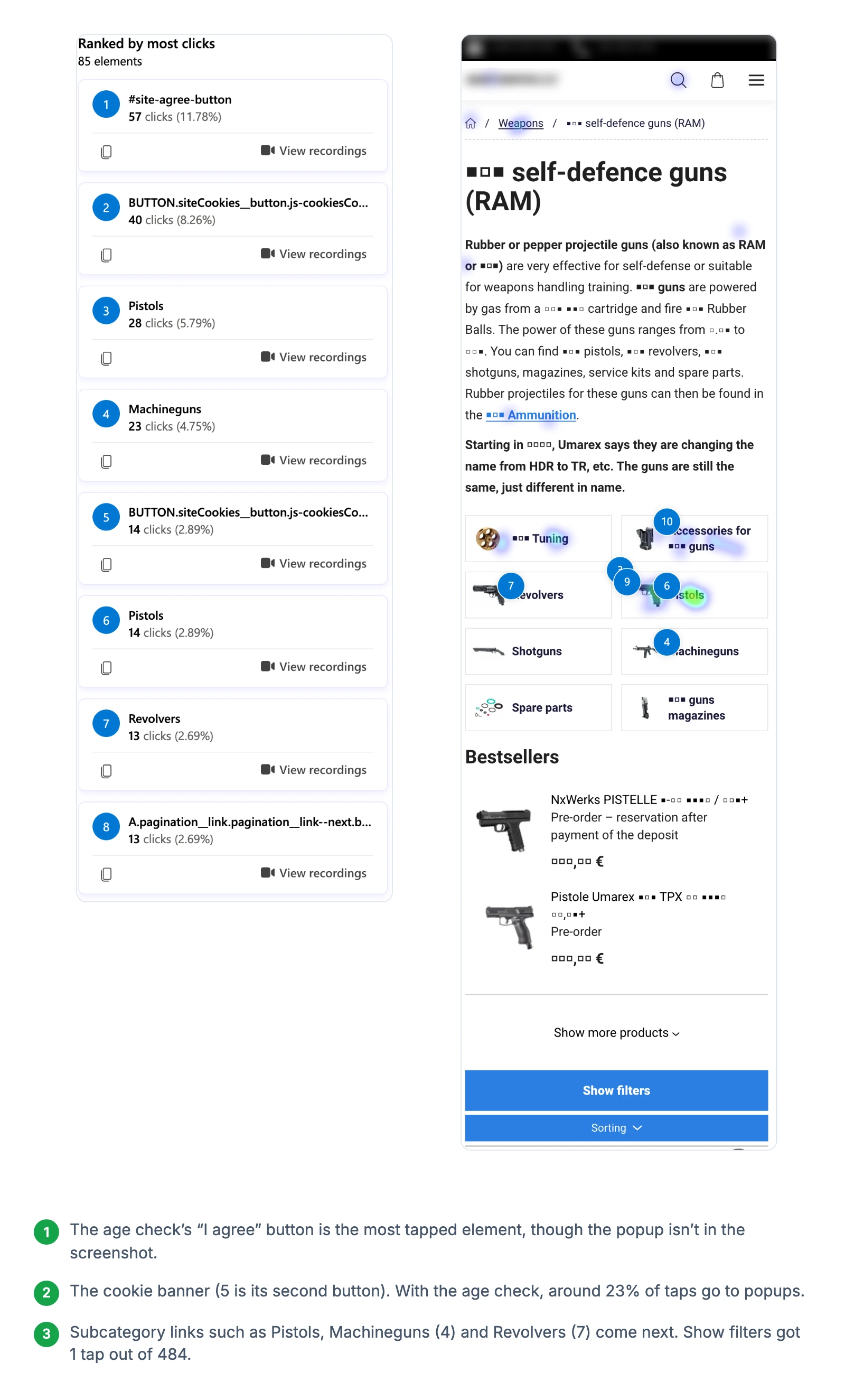
Sorting deserves its own look. Price is the most used sort type, yet around 69% of sites don't offer all four sort types Baymard recommends. If the sort menu gets taps, open recordings of the sessions that used it from the click map. Shoppers who keep returning to the menu or leave without opening a product may not have found the option they wanted.
Dead clicks on product cards often mean part of the card isn't linked. Ratings, badges, stock labels and the white space around the image can look clickable. In 2016, Baymard found that around 76% of sites had list items where it wasn't clear what could be clicked or where it would lead. For a card that leads to one product page, make the whole card one hit area. Cards with quick add, wishlist or swatch buttons need those as separate controls, with the product link clearly marked. Dead clicks show you which parts shoppers expect to work.
Quick backs from a product page to the list are the last thing to check. They can mean the card promised something the product page didn't deliver, such as the right variant, a price or stock. Filter recordings on quick backs from product pages to see which products trigger them.
What to look for on cart pages
The checkout button should be easy to find and lead reliably into checkout, but its share of taps isn't a health score. Quantity changes, removals and express payment buttons draw taps for good reasons. When taps spread across shipping details, quantity controls and "continue shopping", check your checkout-start rate and a few recordings before you read it as hesitation.
- Show the delivery cost and date in the cart if shoppers tap shipping details. In a Baymard survey, around 40% of shoppers who abandoned named extra costs that were too high (shipping, tax, fees) as a reason. Average cart abandonment sits around 70%.
- Collapse the discount field behind a link if shoppers leave after tapping it. Around 70% of sites show a coupon field, and Baymard observed test users leaving to hunt for codes. Recordings tell you whether the taps end in exits. Our Shopify coupon codes guide covers the setup.
- Use recordings, not heatmaps, for cart drawers. A slide-out cart rarely appears in the heatmap screenshot, and scroll maps only measure page scrolling. The comparison of cart drawers and cart pages explains when each converts better.
Past the cart, visibility depends on the platform. WooCommerce checkout runs on your own domain, so Clarity typically records it, with form inputs masked and embedded payment fields out of view. On Shopify plans below Plus, Clarity can't record checkout, so the checkout optimization guide and your platform's own checkout reports have to fill that gap.
See which conversion issues your store has right now
Rage clicks, dead clicks and quick backs: what they mean in a store
Clarity's dashboard shows four frustration signals, each as a share of sessions with a link to the matching recordings (Microsoft Learn). The definitions below are Clarity's own tooltip wording.
| Signal | Clarity's definition | Common store cause | Check before acting |
|---|---|---|---|
| Rage clicks | User rapidly clicked or tapped in the same small area | Slow add-to-cart, a button that doesn't respond, a photo that won't zoom | Quantity steppers and gallery arrows get tapped repeatedly on purpose |
| Dead clicks | User clicked or tapped on a page with no effect | Unlinked images, badges, text styled like a link | Some taps just dismiss a popup or start a scroll |
| Quick backs | User navigated to a page then quickly returned to the previous one | Product page doesn't match the card, wrong category | Without a consent signal in Europe, quick backs read as zero |
| Excessive scrolling | User scrolled through a page more than expected | Hunting for shipping, sizes or specs on a long page | Long content read on purpose |
Microsoft doesn't publish the thresholds behind these signals. Other tools define them differently. FullStory, for example, uses its own rules, so a rate in Clarity isn't comparable with a rate from another tool.
For a reference point, look at Clarity's Shopping benchmark, a beta covering the US and Japan that updates daily. On 28 September 2026 it showed rage clicks around 0.22%, dead clicks around 3.90% and quick backs around 8.77%. Microsoft doesn't say what those percentages are calculated from, so use them as rough orientation. Open the heatmap before you judge a percentage, because the dead-click view names the elements behind the number.
Each dashboard card has a "Set as filter and go to recordings" button. That shortcut to the sessions behind a number is where a signal turns into something you can fix.
How to use Clarity session recordings without watching hundreds
Recordings show what a heatmap can't: the order of events. Filter before you watch. Combine one page template, one device and one signal, for example mobile cart pages with dead clicks (Clarity filters).
Then block out time. Contentsquare says it usually takes about 10 to 15 recordings to get into a good watching flow and suggests setting aside one to two hours. Write down what you see as you watch, one row per recording: page, what the shopper tried, where they stopped. CXL describes keeping a spreadsheet like this and having two or three people watch, so one viewer's assumptions don't decide the result.
Clarity's AI features cut the watching time. Session Insights writes a summary of a recording (it skips sessions under five seconds), and Highlights jumps to the moments that matter. Favorite the recordings worth keeping, because recordings expire after 30 days while favorites stay for nine months (Microsoft Learn). And remember that masked prices appear as blank squares here too.
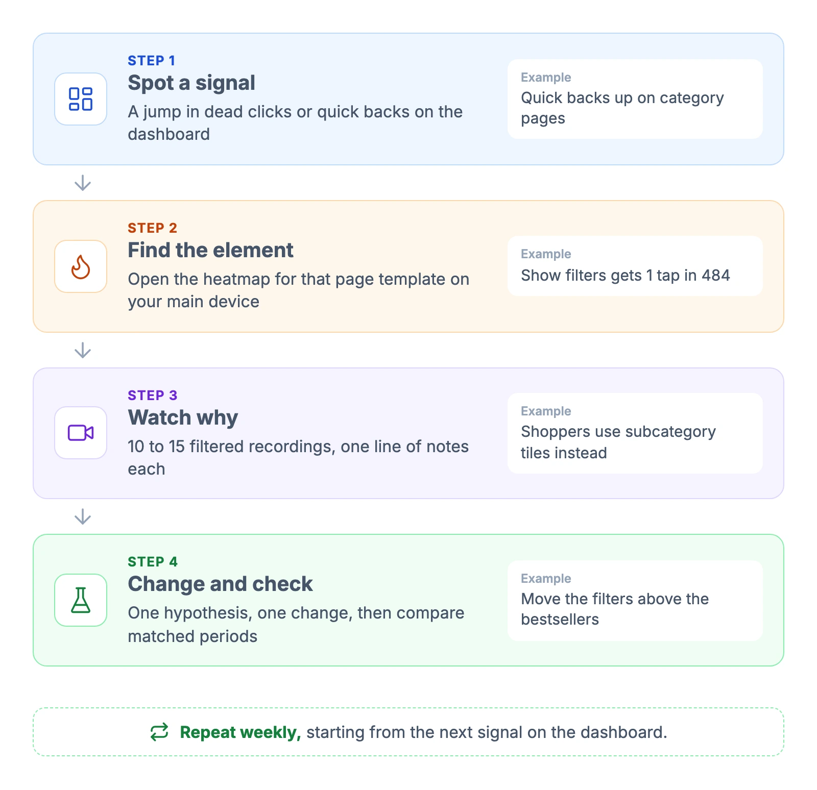
End every round of watching with one written hypothesis, such as: "Fewer than half of mobile product page visitors reach the add-to-cart button. Moving it above the 50% scroll line may raise add-to-cart events per product page view." If your traffic allows a test, size it first with an A/B test sample size calculator. Smaller stores can compare matched before-and-after periods instead, as directional evidence only: keep the device, page group and traffic mix the same, and check an outcome such as add-to-cart rate, not just the heatmap. The guide to Shopify A/B testing covers both options.
Microsoft Clarity vs Google Analytics 4 (and Hotjar)
Clarity and GA4 answer different questions, so running both is worth it.
| Question | Google Analytics 4 | Microsoft Clarity |
|---|---|---|
| How many visitors, from which channels, and how many bought? | Yes, its main job | Only a summary dashboard |
| Where on the page do people tap and how far do they scroll? | No page heatmap; the scroll event fires once, at 90% depth | Click, scroll and area maps |
| Can I replay what one visitor did on the page? | No; User explorer shows an event timeline | Yes, session recordings |
| Why did a funnel step lose people? | Shows where, not why | Shows the behavior behind it |
GA4 has no page heatmap. Its exploration types are free-form tables, funnels, paths, cohorts and a user explorer (Google Analytics Help). Its built-in records a single event when a visitor reaches 90% of the page. Connect GA4 to Clarity rather than choosing between them. The connection adds GA4 data to a Clarity dashboard, with one GA4 property per Clarity project. It doesn't support GA4 segments or send recording links into GA4 (Microsoft Learn). Expect the session counts to differ between tools, the same way Shopify sessions and GA4 sessions rarely match.
Hotjar is now part of Contentsquare, and its pricing page redirects there. The free plan covers up to 200,000 sessions a month with one month of data, and paid plans start at $49 a month ($39 billed yearly; visitors in Europe see the same numbers in euros). Lucky Orange has no free plan and starts at $32 a month billed yearly for 3,500 sessions (Lucky Orange). For heatmaps and recordings alone, Clarity is hard to beat on price. The paid tools earn their fee with longer data access, deeper analysis features and support.
Common mistakes when reading Clarity data
- Judging a single URL. A product page with five visits can show a 100% dead-click rate. Group URLs by template and look at page types.
- Reading the desktop map for a mobile store. Check the device split first and read the map your visitors actually saw.
- Ignoring consent mode. On European traffic without a consent signal, sessions, quick backs and funnels are distorted. Page-level heatmaps hold up better, though they can be incomplete too.
- Trusting the screenshot. The background is one random session, so menus, drawers and even the product shown may differ from what most shoppers saw.
- Acting on one recording. One confused shopper is an anecdote. Look for the same behavior across several sessions before you change the page.
- Forgetting the mask. Blank squares where the price should be are Clarity's masking, not a bug on your store.
FAQ
Is Microsoft Clarity really free?
Yes. Microsoft's pricing page lists Clarity as free, and the company says the data helps improve its machine learning models. The limits are caps rather than fees: up to 100,000 recorded sessions per project per day and 100,000 page views per heatmap.
Is Microsoft Clarity legal and GDPR compliant?
It can be used lawfully, but consent is part of that. Since 31 October 2025, Clarity expects a consent signal for visitors from the EEA, the UK and Switzerland. Regulators such as the UK's ICO also treat recordings of individual visitors as needing consent. Collect consent where required and name Clarity in your privacy notice.
Is Microsoft Clarity better than Google Analytics?
They do different jobs. GA4 measures traffic, channels and conversions, and it has no page heatmap. Clarity shows where people tap and scroll and lets you watch sessions. Running both, with GA4 connected to Clarity, covers both jobs.
Does Microsoft Clarity record Shopify checkout?
Only on Shopify Plus. Microsoft tracks checkout and post-checkout pages for Plus stores through Shopify's pixel, and Shopify restricts the events that replay tools need on checkout to Plus. On other plans, recordings stop when the shopper enters checkout.
How much traffic does a Clarity heatmap need?
Microsoft sets no minimum. CXL suggests around 2,000 to 3,000 page views per design screen per device before trusting a click map. Group URLs by template and widen the date range to reach that on a smaller store.
A weekly Clarity routine
- Check the dashboard for changes. Compare dead clicks and quick backs with the previous week, or the previous 28 days on a smaller store, and look at counts as well as percentages before you chase a jump.
- Open three heatmaps on your main device. Product, category and cart templates, grouped by URL pattern.
- Watch 10 to 15 filtered recordings on the biggest change, and write one line per recording. Highlights shortens each one.
- Write one hypothesis and one change. Then compare matched periods before and after it goes live, heatmaps plus an outcome metric.
Clarity shows what shoppers do. Which of those behaviors cost you orders is still your call, and the heatmap tells you where to look first.
Disclaimer: This article is for informational purposes only and does not constitute legal advice. Consent rules for analytics and session recording differ between countries and can change. For your specific situation, consult a qualified professional. Information is valid as of the publication date.

Jakub is the founder of Ecomhint, an AI-powered ecommerce audit tool focused on UX and conversion optimization. He helps online stores identify friction points across product pages, cart, and checkout using CRO best practices and original research data.
Jakub is the founder of Ecomhint, an AI-powered ecommerce audit tool focused on UX and conversion optimization. He helps online stores identify friction points across product pages, cart, and checkout using CRO best practices and original research data.
