Shopify Conversion Rate Optimization: Boost Your Sales Now
Before you start tweaking buttons and rewriting copy for your Shopify conversion rate optimization, you need to know where you're starting from. Figuring out what a "good" conversion rate actually looks like—and how your store measures up right now—is the only way to begin. This isn't about chasing abstract numbers; it's about setting a solid, realistic baseline for growth.
Benchmarking Your Shopify Conversion Rate
You can’t improve what you don’t measure. Seriously. Kicking off a conversion optimization push without knowing your current numbers is like starting a road trip without a map. The goal isn't just to aim for "higher" conversions; it's to understand the story your data is telling you today.
Think of it like getting a health check-up before starting a new fitness plan. You need to know your starting point to set meaningful goals and actually see if your efforts are paying off.
What Is a Good Shopify Conversion Rate Anyway?
First things first, there's no magic number that defines a "good" conversion rate for every single store. It’s a moving target that depends heavily on your niche, product price point, and where your traffic comes from. A shop selling $2,000 custom furniture will have a wildly different benchmark than one selling $20 t-shirts.
That said, we can look at industry averages to get our bearings. Based on Shopify's platform data and general ecommerce benchmarks for 2025, a healthy conversion rate typically falls somewhere between 2.5% and 3%.
Things get really interesting when you look at top performers. According to Shopify's own analytics, hitting a 3.2% conversion rate puts you in the top 20% of all merchants on the platform. If you can push that to 4.7%, you’ve officially made it into the top 10%. You can discover more insights about these ecommerce conversion rate benchmarks to see exactly how you stack up.
Key Takeaway: A conversion rate north of 3.2% is a huge win. It’s a clear signal that you're outperforming most of your peers and that your user experience, products, and marketing are all hitting the right notes.
To help you visualize where you stand, we've put together a simple breakdown of performance tiers.
Shopify Conversion Rate Performance Tiers
This table outlines different performance levels for Shopify stores based on their conversion rates, helping you benchmark your own store's success.
| Performance Tier | Conversion Rate (%) | What This Means for Your Store |
|---|---|---|
| Needs Improvement | Below 1.0% | Your store may have significant friction points in the user journey. It's time for a deep dive into your site's usability, product-market fit, and traffic quality. |
| Average | 1.0% - 2.4% | You're on par with many stores, but there's plenty of room for growth. Focusing on key optimization areas could deliver a significant boost in revenue. |
| Good | 2.5% - 3.1% | You're doing well! Your store is performing above average. Now is the time to refine your strategies, test new ideas, and aim for the top tier. |
| Excellent | 3.2% - 4.6% | Congratulations, you're in the top 20% of Shopify stores. Your focus should be on incremental improvements and maintaining your competitive edge. |
| Top Tier | 4.7% and above | You are among the elite top 10% of Shopify merchants. Your store is a well-oiled machine. Continue innovating and scaling what works. |
Finding your place in this table gives you a clear, objective sense of where you are and where you need to go next.
Finding Your Numbers in Shopify and Google Analytics
Ready to find your baseline? You'll primarily be living in two places: Shopify Analytics and Google Analytics. Both are crucial for getting the full picture.
Here's exactly where to look:
- Shopify Analytics: This is the easiest place to start. Just head to
Analytics > Reports > Online store conversion rate. This dashboard gives you a clean, no-fuss look at how many of your sessions turn into sales. - Google Analytics 4 (GA4): For a more granular view, navigate to
Reports > Monetization > Ecommerce purchasesin your GA4 property. The "session conversion rate" metric here tells you the percentage of sessions that included a purchase.
Go Beyond the Overall Average
Your overall conversion rate is just the headline. The real insights—the ones that lead to meaningful change—are buried deeper in the data. This is where you put on your detective hat and start segmenting.
Breaking down your conversion rate by different dimensions will show you exactly where the leaks are in your funnel. Start with these three:
- Device Type: How do desktop, mobile, and tablet shoppers behave? It's almost a given that mobile conversion rates will lag behind desktop. If you see a massive gap, it’s a red flag pointing to problems with your mobile experience, like a clunky checkout or slow load times.
- Traffic Source: Are visitors from organic search converting better than your paid social ads? Slicing your data by channel (Google, Facebook, Instagram, Email, etc.) shows you which marketing campaigns are actually making you money and where you might be wasting ad spend.
- Customer Segment: What’s the difference in conversion between a first-time visitor and a returning customer? Loyal customers should always convert at a higher rate. If they aren’t, you might have a problem with customer satisfaction or your post-purchase follow-up is falling flat.
Optimizing Your Homepage for Lasting First Impressions
Think of your homepage as your virtual storefront. It's the first thing people see, and you’ve got maybe three seconds—if you're lucky—to convince them to stick around. This is where your entire Shopify conversion rate optimization effort begins. If you lose them here, they're gone for good.
The first, most critical job of your homepage is to instantly answer the visitor's unspoken question: "What's in it for me?" That's your unique value proposition (UVP). It’s not just a tagline; it's a promise. It needs to clearly state the benefit you offer, the problem you solve, and what makes you the best choice. Don't bury it. Make it the first thing people read, right at the top of the page.
Great visuals are your UVP's best friend. We're visual creatures, after all. A stunning photo or a well-produced video showing your products in their element can convey value and emotion much faster than a block of text ever could. It's the difference between telling someone your product is great and actually showing them.
Crafting a Compelling Visual Narrative
The images and videos on your homepage aren't just there to look pretty. They need to tell a story and guide your visitor's eye toward what matters. A powerful "hero" shot right at the top can set the entire tone for your brand and create an immediate emotional hook.
For instance, if you sell outdoor gear, don't just show a backpack on a white background. Show a video of it being tested on a rugged mountain trail. That imagery instantly screams durability and adventure, which is far more powerful than just writing the words.
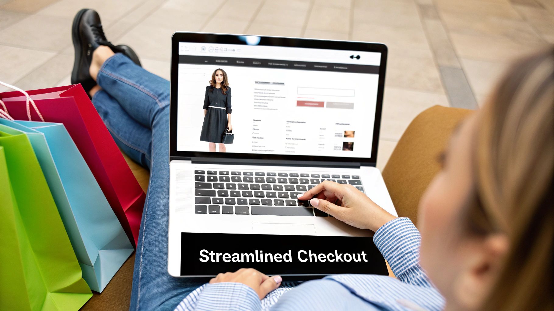
You can see a great example of this clean, direct approach from EcomHint. They pair a clear headline with a can't-miss call-to-action, making it dead simple for a visitor to understand the service and jump right in.
This screenshot nails it: a strong value prop combined with a clear next step. There's no guesswork involved.
Building Trust from the First Click
Let's be honest—new visitors are skeptical. They’re sizing you up, wondering, "Is this site legit? Can I trust them with my credit card?" Your job is to answer those questions before they're even fully formed by weaving trust signals throughout your homepage.
These signals are all about providing social proof and security assurances to calm a new customer's nerves.
- Customer Reviews & Testimonials: Get your best reviews and star ratings up high. Seeing that real people loved your products is one of the most persuasive tools you have.
- Security Badges: Display the logos people already know and trust, like Shopify Pay, PayPal, and Visa. An SSL certificate badge is non-negotiable—it shows the connection is secure.
- Media Mentions: If you've been featured in any publications, get those logos on your homepage. That "as seen in" section lends you instant credibility from a trusted source.
- Social Proof Notifications: Those little pop-ups saying "Someone in New York just bought..." can work wonders. They create a sense of urgency and show that your store is active and trusted.
Expert Tip: Don't just slap one static review on your homepage and call it a day. I recommend integrating a dynamic feed of your latest, most authentic reviews. Tools like Yotpo or Loox can pull these in automatically, keeping your social proof fresh and, most importantly, believable.
Guiding the User with Clear Direction
A homepage can be beautiful, but if it doesn't tell people what to do next, it's failed. Every single element should work together to point visitors toward the next step in their journey, and that journey is paved with your calls-to-action (CTAs).
Your main CTA needs to be unmissable. Use a bold, contrasting color that makes it jump off the screen, and write copy that inspires action. Ditch passive phrases like "Learn More." Go for something direct and compelling, like "Shop Our Best Sellers" or "Build Your Custom Kit."
Navigation is just as important. A confusing menu is a dead end for visitors. Keep your main navigation bar clean and simple, using category labels that anyone can understand instantly. If you sell clothes, use "Tops," "Bottoms," and "Dresses"—not some branded, cutesy term no one will get. The goal is zero friction. If someone can't find what they're looking for in a couple of clicks, you've probably lost them forever.
Crafting Product Pages That Actually Convert

If your homepage is the window display, your product page is where customers try things on. It’s the make-or-break moment where a casual browser decides to become a buyer. This is why any serious effort at Shopify conversion rate optimization has to zero in on turning this page from a dry catalog entry into a compelling sales pitch.
Too many stores fall into the trap of just listing specs and features. The real secret is to stop talking about what your product is and start showing what it does for the customer. You need to tell a story and solve their problem. A great product description builds a connection, helping the visitor picture how this item will genuinely make their life better.
For instance, don't just say, "Made from 100% merino wool." Instead, try something like, "Stay warm on the trail without the bulk. Our ultra-soft merino wool is a natural moisture-wicker, keeping you comfortable from sunrise to sunset." See the shift? One is just a fact; the other is a feeling, a solution.
Your Photos and Videos Have to Do the Selling
In ecommerce, your visuals are your sales team. Customers can't touch, feel, or try on your product, so your imagery needs to fill that sensory void. A few low-res, single-angle photos just won’t cut it anymore—it's a surefire way to kill conversions.
To give a customer the confidence to hit "Add to Cart," you need to get serious about your visual game:
- High-Resolution Images: Let people zoom in and see every stitch, every detail. Show the product from every conceivable angle, in different real-world settings, and maybe next to a common object to give a sense of scale.
- Product Videos: Nothing sells a product in action like a video. It can show off features and benefits in a way a static photo never could. In fact, a good video can boost conversions on a product page by as much as 80%.
- 360-Degree Views: This is the closest you can get to putting the product in their hands. Letting customers spin and examine it from all sides is an incredibly powerful interactive tool.
These aren't just fancy extras anymore. They're essential for knocking down purchase hesitation and building the trust you need to make the sale.
Expert Tip: Don’t just show the product; show the result. If you sell skincare, your most powerful visual isn't the bottle—it's the glowing, healthy skin your customer is dreaming of. Always connect your product to the desired outcome.
The Unmistakable Power of Social Proof
Here’s a simple truth: shoppers trust other shoppers more than they'll ever trust a brand. Social proof is the online version of a friend's glowing recommendation, and it's one of the most potent conversion tools you have.
Without it, you're asking a potential customer to take a leap of faith. With it, you're giving them a safety net woven from the experiences of others. This is especially vital for first-time visitors who don't know your brand and are looking for a sign that they're making a good decision.
Let Your Customers Do the Talking
Weaving social proof directly into your product page isn't optional. It validates the purchase and offers authentic insights that your own brand copy simply can't match.
Here are the best ways to put it to work:
- Customer Reviews and Ratings: This is table stakes. Make sure star ratings are visible right by the product title. Don't be afraid to show a mix of reviews—the detailed positive ones and even the constructive ones build a huge amount of trust.
- User-Generated Content (UGC): Actively encourage your customers to share photos of themselves using your products. A gallery of real people happily using your item is incredibly persuasive and helps new shoppers visualize it in their own lives.
- Expert Endorsements: If an industry blogger, influencer, or publication has given your product a shout-out, display their logo or a key quote. This kind of third-party credibility adds a layer of authority.
Clear Up Any Last-Minute Doubts
Right before they commit, a customer’s brain is looking for logistical roadblocks. Any confusion about shipping costs, return policies, or payment options can create that last-second hesitation that leads directly to an abandoned cart.
Put this information where they can't possibly miss it. Clearly state shipping estimates, provide an obvious link to your returns policy, and display the logos of payment methods you accept—all right there, near the "Add to Cart" button. And speaking of that button, make sure it’s the most eye-catching thing on the page. Use a bold, contrasting color and clear, action-focused text.
Ultimately, a high-converting product page creates an atmosphere of confidence. It’s where compelling stories, rich visuals, powerful social proof, and crystal-clear logistics all come together to turn a "maybe" into a "yes."
While the global average Shopify conversion rate for 2025 is a modest 1.4%, top-tier stores are hitting 4.8% or even higher. The good news is that research shows applying just 10 to 15 smart optimization tactics can boost conversions by 25% to 40% in as little as two months. Explore the full Shopify conversion rate optimization tactics for 2025 to see how.
Designing a Frictionless Cart and Checkout Flow
You’ve done all the hard work. A shopper found your store, fell in love with a product, and even clicked “Add to Cart.” This should be the moment of celebration, but for far too many Shopify stores, it’s where the sale goes to die.
The journey from the shopping cart to the final confirmation page is a minefield of potential friction, and cart abandonment is the silent killer of your sales. The truth is, nearly 70% of online shopping carts are abandoned. Ouch.
Why does this happen? Usually, it's something fixable: unexpected costs, a forced account creation, or a checkout process that just feels like a chore. Any serious Shopify conversion rate optimization strategy has to obsess over plugging the leaks in this critical final phase.
Your goal is to make buying from your store so easy, so transparent, and so secure that customers don't even have a chance to second-guess their decision.
Eliminating Surprise Costs and Building Trust
The number one reason for cart abandonment, year after year, is surprise costs. Nothing kills the buying mood faster than seeing a price you’ve agreed to suddenly inflate with shipping, taxes, and mysterious fees at the very last second. It instantly breaks trust.
The solution is radical transparency. You have to show all costs upfront, long before they get to the final payment screen.
- Add a Shipping Calculator: Integrate a shipping calculator right on the cart page. Let users pop in their zip code and see their options immediately.
- Be Clear on Taxes: Don't surprise them. A simple line like, "Taxes calculated at the next step," is enough to manage expectations.
- No Hidden Fees. Period. If you have handling or processing fees, they need to be communicated on the product page, not sprung on the customer at checkout.
Trust goes beyond just being transparent about money. You need to visually reassure customers that their payment info is safe. This is where trust badges and security seals from well-known names like Shopify Pay, PayPal, Norton, or McAfee come in. They create an immediate sense of security and professionalism.
This A/B test result shows just how powerful these changes can be. It compares a standard checkout against a simplified version with clearer trust signals.
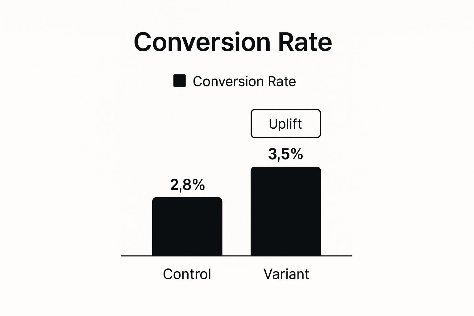
The data doesn't lie. Even small tweaks to reduce friction and boost confidence during checkout can lead to a serious lift in conversions.
Streamlining the Path to Purchase
Every single field a customer has to fill out, every click they have to make, is another opportunity for them to get distracted and bounce. Your job is to be ruthless in cutting down the steps between the cart and the "Thank You" page.
Key Insight: Don't gatekeep the purchase. Forcing a user to create an account before they can buy is one of the fastest ways to lose a sale. Always, always offer a guest checkout option. You can gently prompt them to create an account after the sale is complete, highlighting benefits like easier order tracking.
A visual progress indicator is another fantastic tool. Just seeing simple steps laid out—like "Shipping > Payment > Review"—helps manage expectations and shows customers they’re almost at the finish line. It makes the whole process feel faster and less overwhelming.
Key Checkout Friction Points And Their Solutions
I've seen the same handful of issues tank conversion rates time and time again. Below is a quick breakdown of the most common friction points I encounter during a CRO audit and the straightforward solutions to fix them.
| Friction Point | Impact on Conversion | Recommended Solution |
|---|---|---|
| Forced Account Creation | High. Many first-time buyers will abandon the cart rather than commit to an account. | Always offer a prominent "Guest Checkout" option. Prompt for account creation post-purchase. |
| Unexpected Costs | Very High. The #1 reason for cart abandonment. It breaks trust at the final step. | Use a shipping calculator on the cart page and be transparent about all potential taxes or fees early on. |
| Long/Complex Forms | Moderate to High. Asking for too much information creates user fatigue and frustration. | Only ask for essential information. Use tools like address auto-complete to speed up the process. |
| Lack of Payment Options | Moderate. Customers have strong preferences and may not trust or have access to limited options. | Offer a mix of traditional cards, digital wallets (Apple Pay, Google Pay), and a trusted third-party like PayPal. |
| No Visible Trust Signals | Moderate. Shoppers are wary of scams and need reassurance their data is safe. | Prominently display security badges (SSL, McAfee, etc.) and accepted payment logos near payment fields. |
| Poor Mobile Experience | High. Over half of ecommerce traffic is mobile. A clunky mobile checkout is a deal-breaker. | Ensure your checkout is fully responsive with large form fields, easy-to-tap buttons, and minimal scrolling. |
Addressing these common roadblocks isn't just about small tweaks; it's about fundamentally respecting the customer's time and trust, which is the cornerstone of a high-converting checkout experience.
Offer Payment Flexibility and Speed
Today's shoppers expect choices. Limiting payment options is like a physical store only accepting one type of credit card—you’re just turning people away. Offering multiple, trusted payment gateways isn't a luxury; it's a necessity for maximizing sales.
Here are the essentials you should have:
- Shop Pay: This is a no-brainer for Shopify stores. It's an accelerated checkout that lets returning customers buy with a single click. A massive friction-reducer, especially for mobile shoppers.
- PayPal: A globally recognized brand that gives customers a secure way to pay without sharing their card details directly with your store. It's a huge trust-builder for new and international buyers.
- Apple Pay / Google Pay: These digital wallets are the definition of speed. They allow for lightning-fast, biometrically-secured payments on mobile, completely bypassing the need to type in card numbers and addresses.
- BNPL (e.g., Klarna): "Buy Now, Pay Later" services are incredible for increasing your average order value. They make larger purchases feel more manageable and less intimidating for shoppers.
By offering a diverse range of payment methods, you cater to every customer's unique preference for security, speed, and financial flexibility. This simple act of providing choice can be the final nudge a hesitant buyer needs to click "Confirm Purchase."
Using Pop-Ups and Urgency to Drive Action

Let's be honest, most people flinch when they hear the word "pop-up." They've earned a bad reputation for being intrusive and annoying—and a lot of them are. But when you use them thoughtfully, they can transform from a minor nuisance into one of the most effective tools for Shopify conversion rate optimization.
The secret is to stop thinking of them as interruptions and start seeing them as perfectly timed offers. Instead of just throwing a generic "10% off" coupon at someone the second they land on your site, you can create a much smarter and more helpful experience.
And the data doesn't lie. Insights from 2025 CRO statistics show a massive opportunity here. While only 39.4% of merchants use pop-ups, those who do see an average conversion rate of 11.09% from them. The real winners are pop-ups triggered by specific user actions, like an attempt to leave the page. This is a clear signal that you can capture leads and slash abandonment rates. You can see more of these powerful CRO statistics for yourself.
Making Pop-Ups That People Actually Like
For a pop-up to really work, it needs to offer genuine value and show up at just the right moment. The goal is to make the user feel like you’re helping them out, not just begging for their email.
Here are a few scenarios I've seen work wonders time and time again:
-
The Exit-Intent Lifesaver: When a user's cursor shoots up toward the back button or to close the tab, that's your cue. This is the ideal moment for an exit-intent pop-up with an offer they can't ignore, like "Wait! Take 15% off your first order." It’s your last shot to turn a bounce into a sale.
-
The First-Time Visitor Welcome: Greet new visitors with a warm welcome and a little something to get them started. A simple pop-up offering a discount on their first purchase for their email is a classic for a reason—it builds your list and gives them a reason to shop right away.
-
The Cart Abandonment Nudge: If someone has items in their cart but seems to have stalled, a pop-up on the cart page can be the gentle push they need. Something like, "Need a little help? Here's 10% off to complete your order," can be incredibly effective at getting them over the finish line.
Expert Insight: The design of your pop-up is just as important as the offer itself. Keep it clean, on-brand, and incredibly easy to close. A huge, clunky box with a microscopic "X" is a guaranteed way to frustrate someone. Make your value proposition obvious and the call-to-action button unmissable.
Creating Urgency Without Being Pushy
Beyond pop-ups, you can use simple psychological triggers to create a sense of urgency that encourages shoppers to buy now instead of "maybe later." This is all about the principle of scarcity. When a customer thinks they might miss out on a great deal or a popular item, they're far more likely to pull the trigger.
The key is to keep it authentic. Faking scarcity is a fast way to lose trust. Instead, leverage the real-time data from your Shopify store to create genuine motivation.
Proven Urgency Tactics for Shopify
Here are a few tactics you can build directly into your product and checkout pages to spur quicker decisions:
-
Low-Stock Indicators: A simple message like "Only 3 left in stock!" creates a powerful sense of FOMO (fear of missing out). This works especially well for best-sellers because it highlights both high demand and limited availability.
-
Countdown Timers: For a flash sale or limited-time discount, a countdown timer is a must. Seeing "Sale ends in 02:15:43" or "Your cart is reserved for 10:00 minutes" creates a real, tangible deadline that prompts action.
-
Social Proof Notifications: Little pop-ups like "Jessica from Miami just bought this!" are brilliant because they do two jobs at once. First, they show that other people are actively buying from you (which builds trust), and second, they imply the product is in high demand and might sell out soon (which creates urgency).
By combining well-timed, value-packed pop-ups with genuine urgency, you create a persuasive shopping environment that guides customers toward completing their purchase. It’s not about tricking anyone; it's about respectfully showing them the value and motivating them to act on their interest before it fades.
Got Questions About Shopify CRO? We've Got Answers.
Jumping into conversion rate optimization for your Shopify store can feel like opening a can of worms. Suddenly you're drowning in data, new tools, and a million different "best practices." It's easy to get overwhelmed and not know where to even begin.
Let's cut through the noise and tackle some of the most pressing questions I hear from Shopify merchants who are serious about turning more of their traffic into sales.
What Are the Best CRO Tools for a Shopify Store?
Look, Shopify's built-in analytics are a decent starting point, but if you want to truly understand why people are leaving your store, you need to bring in some specialists. You don't need a massive, expensive tech stack; just a few smart tools will give you the insights you need.
Here’s the toolkit I recommend to most store owners:
- See What Your Visitors See: You absolutely need a heatmap and session recording tool. Something like Hotjar or Lucky Orange is non-negotiable. They let you watch real user sessions, see where people are clicking (or not clicking), and find the exact spots where they get frustrated and leave. It’s like looking over their shoulder.
- Stop Guessing, Start Testing: If you’re on Shopify Plus, you already have access to some solid A/B testing features. For everyone else, a tool like VWO is fantastic for testing different headlines, button colors, or product page layouts. This is how you replace "I think this will work" with "I know this works."
- Just Ask Your Customers: Sometimes the easiest way to find a problem is to ask. Use a simple tool like Typeform to create a post-purchase survey or an on-site poll to ask abandoning visitors why they didn't buy. The feedback you get is pure gold.
How Often Should I Be A/B Testing?
This is a classic "it depends" question, but the answer really hinges on one thing: your traffic. A brand with 500,000 monthly visitors can get statistically significant results on a test in a few days. If you have 10,000 monthly visitors, that same test could take a month or more.
My Rule of Thumb: Don't just test for the sake of testing. Aim for one meaningful, well-thought-out A/B test per month. Focus it on a high-traffic, high-impact page like your product page or cart.
Trying to rush a test on a low-traffic site is one of the biggest mistakes you can make. You’ll end up with junk data that sends you in the wrong direction. Patience is your best friend here.
What Metrics Matter Besides the Overall Conversion Rate?
Your main conversion rate is a vanity metric if you don't know what's driving it. It's the final score, but you need to watch the game tape to see what happened on each play. Focusing on these more specific metrics will tell you exactly where your funnel is leaking.
- Add to Cart Rate: This tells you how well your product pages are performing. If tons of people are visiting a product page but very few are adding it to their cart, you likely have a problem with your photos, product description, or pricing.
- Checkout Initiation Rate: This is the bridge between the cart and the checkout. A huge drop-off here is a massive red flag. It almost always points to a surprise—usually unexpected shipping costs—or a confusing cart page that makes it hard to proceed.
- Average Order Value (AOV): Are customers buying one cheap item, or are they filling their carts? Getting a customer to spend $75 instead of $50 can be just as powerful as finding a brand new customer. This is where you focus on things like product bundles, smart upsells, and "You're $10 away from free shipping!" offers.
When you start tracking these numbers, you stop throwing random changes at your store and start performing surgical fixes on the parts that are actually broken.
Ready to stop guessing what’s holding back your sales? EcomHint uses powerful AI to analyze your Shopify store, identifying the critical issues that hurt your conversion rate. Get a free, actionable audit in minutes and start making changes that deliver real results. Discover your store’s hidden potential on EcomHint today.
FREE STORE AUDIT
Ready to Apply These Tips? Get started now!
No email required • No credit card • Takes 5-8 minutes