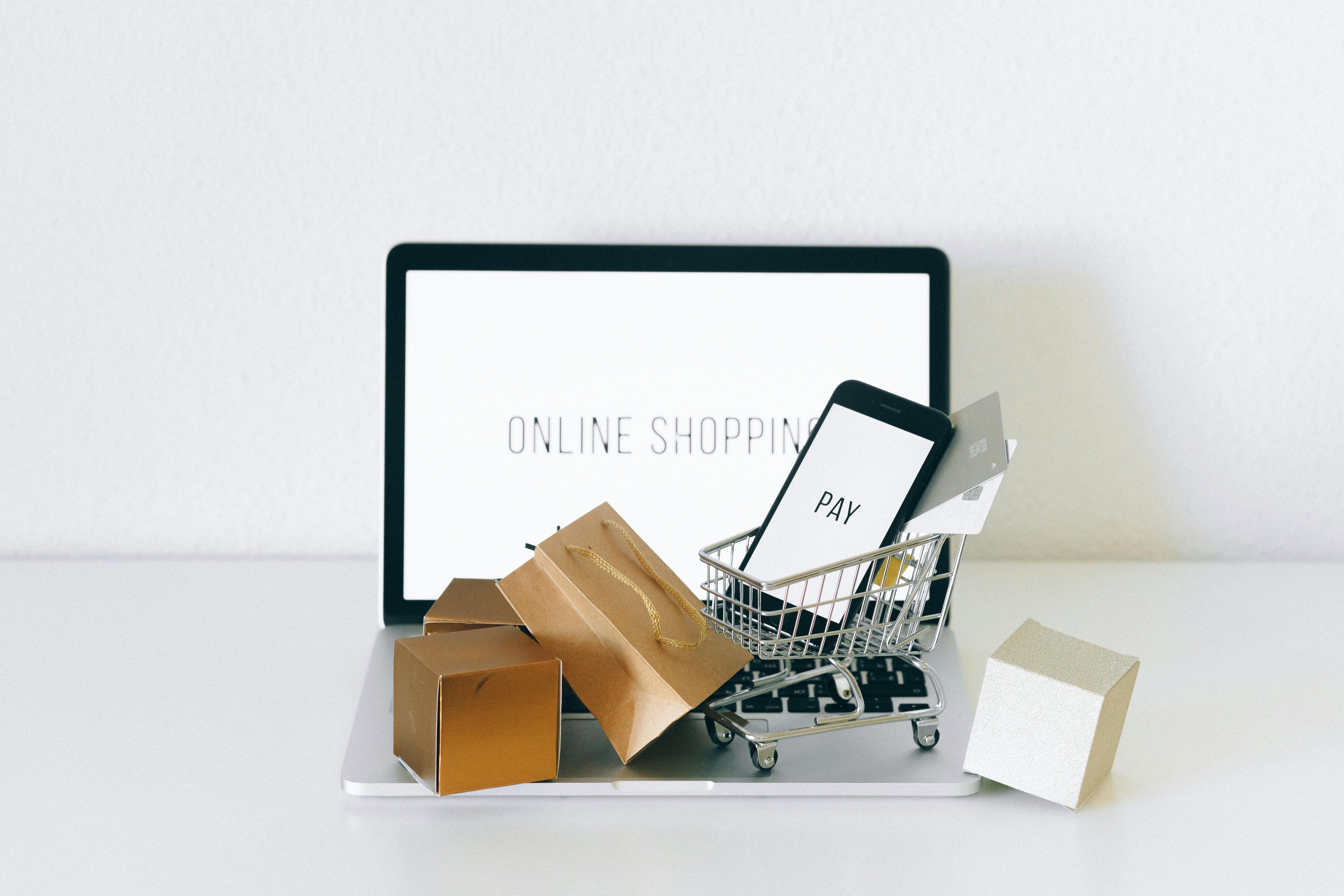
How to Reduce Cart Abandonment and Boost Sales
If you want to slash your cart abandonment rate, you need to find—and fix—the friction in your checkout. It all comes down to being upfront about costs, making the buying process dead simple, and earning your customer's trust *before* they even think about pulling out their credit card.
The Real Reasons Shoppers Abandon Carts
It’s the silent killer of online profits. A customer gets this close to buying, their cart is full, and then… poof. They’re gone. This isn't just a lost sale; it's a huge clue. Every abandoned cart is a story about a specific hiccup in your customer's journey, a piece of feedback hiding in plain sight.
Getting a handle on this is your first real step toward a fix. The average cart abandonment rate across all industries is a staggering 70.19%. Think about that. For every ten people who are ready to buy from you, seven walk away. The problem gets even worse on mobile, where clunky interfaces on small screens make any tiny issue feel like a major roadblock. You can dig into a full breakdown of the data to see how different devices impact abandonment rates.
Instead of seeing this as a failure, you need to see it for what it is: a high-intent shopper telling you exactly where your process fell apart. When you start diagnosing these core problems, you can make small, smart changes that deliver a massive impact on your revenue.
To put this in perspective, let's look at the data. The reasons people leave are surprisingly consistent across the board.
Why Your Customers Are Leaving
This table breaks down the most common reasons shoppers abandon their carts, providing a quick overview of the key friction points we'll solve in this guide.
| Abandonment Reason | Percentage of Shoppers Affected | Primary Solution Area |
|---|---|---|
| Unexpected extra costs (shipping, tax, fees) | 48% | Checkout Optimization |
| The site wanted me to create an account | 24% | UX & Usability Tweaks |
| Delivery was too slow | 22% | Shipping & Fulfillment |
| I didn't trust the site with my credit card | 18% | Trust & Security Signals |
| Checkout process was too long/complicated | 17% | Checkout Optimization |
| I couldn’t see/calculate total order cost up-front | 16% | UX & Usability Tweaks |
As you can see, the biggest culprits aren't just "window shopping." They are tangible, fixable problems within your control.
Moving Beyond Surface-Level Fixes
It’s tempting to write these people off as "just browsing," but the real issues are usually baked right into your shopping experience. That journey—from adding a product to the cart to finally entering payment details—is a minefield of potential problems. These aren't just minor annoyances; they are deal-breakers.
I see the same patterns over and over again:
- Cost Ambiguity: Nothing kills a sale faster than surprise shipping fees, taxes, or other charges popping up on the final page. It creates instant sticker shock and feels dishonest.
- Forced Commitment: Demanding that a customer create an account before they can buy is a huge hurdle. It feels like you're asking for a long-term relationship when all they want is a one-time purchase.
- Checkout Complexity: A checkout that drags on for multiple pages with too many fields feels like work. People are busy and impatient, especially first-time buyers.
- Lack of Reassurance: If your site is missing an SSL certificate, a clear return policy, or logos of trusted payment providers, it can feel sketchy and insecure.
These issues tap into some pretty basic consumer psychology. People want to feel smart, safe, and in control when they spend their money. Anything that introduces doubt or frustration gives them a reason to bail.
Think of it this way: a customer adding an item to their cart is giving you a strong "yes." An abandoned cart is a sudden "wait, I'm not so sure anymore." Your job is to figure out what caused that hesitation.
The Psychology of the Abandoned Cart
When you dig in, these abandonment triggers fall into two buckets: practical and emotional. Practical issues are the tangible things, like a discount code that doesn't work or not offering PayPal. Emotional issues are all about perception—that gut feeling that a site just isn't trustworthy.
Both are equally powerful. A shopper might consciously leave because of high shipping costs. But they might also leave subconsciously because the website's design felt cheap or outdated, which made them feel uneasy about the whole transaction.
Really learning how to reduce cart abandonment means you have to tackle both the logical and emotional sides of the sale. The rest of this guide will give you the exact strategies to do just that.
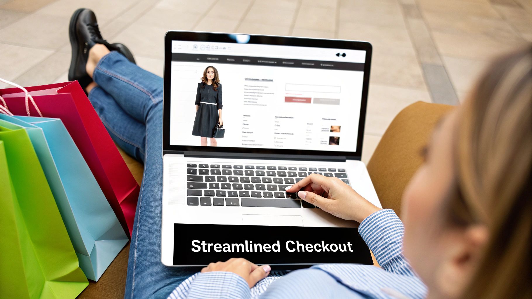
Design a Frictionless Checkout Experience
The checkout process is where the sale is won or lost. It’s the final handshake, the last step in a long journey. If it’s clunky or confusing, you’re essentially tripping your customers right at the finish line. In fact, a complicated checkout process is a top-tier sales killer, responsible for ditching around 17% of potential sales.
Think of it this way: you did all the hard work to get a shopper to your site, they found a product they love, and they even added it to their cart. Fumbling the ball now is just painful. This is where you can make some of the biggest gains by simply getting out of your customer's way.
Eliminate Forced Account Creation
Want to see a shopper’s enthusiasm die in real-time? Force them to create an account before they can buy something. This single roadblock is enough to make 24% of shoppers abandon their carts. They came to buy a product, not sign up for a new long-term relationship.
The fix is surprisingly simple: offer a guest checkout option. Make it the big, bright, obvious choice. You can always invite them to create an account after the purchase is confirmed, letting them save their info for next time with a single click.
By making guest checkout the default, you’re sending a clear message: "We care more about your purchase than we do about your data right now." That small shift in focus can have a huge impact on your conversion rate.
This approach respects your customer's time and gets them through the purchase with as little friction as possible.
Simplify and Streamline Your Forms
Every single field a customer has to fill out is one more tiny reason to just give up. Your mission should be to ask for the absolute bare minimum needed to get the order processed and shipped. Long, complex forms are intimidating and just feel like homework.
Here are a few ways to cut the fat from your checkout forms:
- Auto-fill everything you can. Use tools that populate the city and state from a zip code. A simple checkbox for "Billing address is the same as shipping" is a non-negotiable.
- Give clear visual cues. Labels should always be visible outside the form fields, not as placeholder text that vanishes. Real-time validation that instantly flags a typo in an email address is also a huge help.
- Go for a single page. If your platform supports it, a single-page or accordion-style checkout often feels less daunting than a multi-step process where the end is never in sight.
A streamlined checkout guides the user without overwhelming them. It's not just about looking clean; it’s about reducing the mental effort required to complete a purchase.
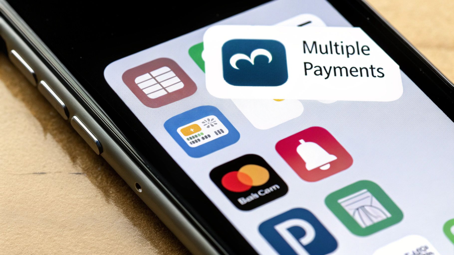
Offer Modern Payment Flexibility
Today’s shoppers have their favorite ways to pay, and they expect you to offer them. If their go-to method isn't there, they have no problem finding a competitor who does. Sticking to just traditional credit cards is a fast way to look outdated.
Integrating a variety of payment gateways shows that you're a legitimate, modern business that understands its customers.
The Payment Options Your Customers Expect:
- Digital Wallets: Things like Apple Pay, Google Pay, and PayPal Express Checkout are game-changers. They allow for one-click payments that pull saved info, letting shoppers bypass the tedious task of typing in their details.
- Buy Now, Pay Later (BNPL): For higher-ticket items, services like Klarna, Afterpay, or Affirm can be the deciding factor. They break down a large purchase into smaller, interest-free installments, making it feel much more manageable.
- Traditional Cards: Of course, you still need to provide a smooth experience for all major credit cards like Visa, Mastercard, and American Express.
By providing these choices, you cater to different buying habits and make the final step feel completely effortless, especially for the massive number of people shopping on their phones.
Build Unbreakable Trust with Every Click

The moment a customer pulls out their credit card, their internal fraud detector goes on high alert. Even the slightest hint that your site isn't 100% secure can send them clicking away. In fact, a simple lack of trust is why 18% of shoppers ditch their carts—a massive, and completely avoidable, loss.
Building that trust isn't about one big, flashy security badge. It's the sum of a dozen small, reassuring signals that tell the customer, "You're in a safe, professional place." Each one works to dissolve doubt and make the decision to buy feel easy.
This is where you prove you’re a legitimate business that takes their security seriously. It’s not a nice-to-have; it's a core requirement for turning browsers into buyers.
Showcase Your Security Signals
As soon as someone hits your checkout, they are actively scanning for signs that their personal data is protected. Your job is to make those signals impossible to miss. These visual cues are instant reassurance, calming those last-minute jitters.
Let's start with the absolute baseline: your entire site needs an SSL certificate, which puts the "https" in your URL. This is non-negotiable and the first thing any savvy online shopper looks for. From there, you need to strategically place other trust badges where they matter most—right next to the payment fields.
Think about adding these essential trust markers:
- Payment Provider Logos: Seeing familiar logos like Visa, Mastercard, PayPal, and Apple Pay instantly lends your store credibility. You're borrowing trust from established, global brands.
- Security Seals: Badges from services like Norton or McAfee show a third-party endorsement of your site’s security.
- Money-Back Guarantees: A clear "30-Day Money-Back Guarantee" badge can be the final nudge a hesitant customer needs, as it removes the perceived risk from their purchase.
These signals should be visible not just at checkout, but on product pages, too. They work subconsciously to make the entire experience feel safer.
Leverage the Power of Social Proof
Nothing builds confidence quite like seeing that other people have already bought from you and had a great experience. Social proof is a powerful psychological trigger because it validates a customer's decision. You're not just telling them you're trustworthy; you're letting other happy customers do it for you.
You have to get authentic customer feedback integrated directly into the shopping journey. Don't bury your best reviews on a separate testimonials page—bring them right to the forefront where decisions are being made.
A fascinating study found that simply displaying customer reviews on product pages can increase conversion rates by as much as 270%. Authentic feedback from real people is almost always more persuasive than the best marketing copy you could write.
For example, I've seen great success with sprinkling star ratings and short, impactful review snippets directly below product titles. You can also feature a powerful quote from a recent happy customer right in the cart or during checkout. It's a simple reminder that they're making a popular and well-vetted choice.
Make Your Policies and Contact Info Obvious
Hidden policies and hard-to-find contact information are massive red flags for shoppers. To them, it feels like you have something to hide. An unclear return policy or a missing phone number can make a business seem shady and unreliable.
You need to do the exact opposite: be radically transparent. This builds a foundation of trust that goes far beyond a simple security seal.
Key Information to Make Accessible:
- Return & Refund Policy: Don't just stick this in your footer. Link to it on product pages and even in the checkout. And please, write it in plain English.
- Shipping Information: Show clear estimates for delivery times and costs before the final checkout step. Surprises here are a primary cause of abandonment.
- Contact Details: Have an easy-to-find "Contact Us" page with a physical address (if you have one), a phone number, and an email. It shows you are a real business with real people ready to help.
By making this information impossible to miss, you project confidence and professionalism. You’re telling customers that you stand by your products and are there to help if anything goes wrong—which is often the final piece of reassurance they need to click "Complete Purchase."
Eliminate Cost Surprises and Offer Smart Incentives
There’s one thing that will send a potential customer running for the hills faster than just about anything else: a surprise fee. When unexpected costs pop up at the very last second, it feels like a classic bait-and-switch. This single issue is the number one reason people abandon their carts, torpedoing nearly 48% of all would-be sales.
It’s not just about the money, either. It’s a psychological blow. A shopper who sees a last-minute shipping charge or a sudden tax calculation feels misled, and that feeling instantly shatters the trust you’ve worked so hard to build. The good news? This is one of the easiest problems to fix with a dose of radical transparency and a few well-placed incentives.
Being completely upfront about every cost doesn't just cut down on abandoned carts. It shows you respect your customer's time and intelligence, turning a major point of friction into a moment that actually strengthens their trust in your brand.
Be Radically Transparent With All Costs
The golden rule here is simple: show the all-in price as early as you possibly can. Don't make people wait until they're about to enter their credit card details to find out what their order really costs.
A shipping calculator right on the cart page is a perfect example of this in action. It lets shoppers punch in their zip code and see the exact shipping cost right away. This gives them a feeling of control and completely eliminates that dreaded sticker shock at the end of the checkout process.
Make sure these costs are visible long before the final step:
- Shipping Fees: Provide a calculator or show an estimated cost based on their location.
- Taxes: If your platform allows it, estimate taxes before the final payment page.
- Handling or Service Fees: Any other charge needs to be clearly itemized and explained.
This approach frames the total cost as part of the initial decision, not a penalty for buying.
Turn Free Shipping Into a Strategic Advantage
"Free shipping" might just be the two most powerful words in all of ecommerce. But offering it on every single order can eat into your profits. The sweet spot is using a free shipping threshold—a minimum order value customers need to hit to unlock the offer.
This tactic is a brilliant win-win. It tackles the high-shipping-cost problem head-on while also nudging customers to add another item or two to their cart. I've personally seen stores boost their average order value by 15-20% just by getting this strategy right.
To really make this work, you need a dynamic banner that updates in real-time. A simple message in the cart that says, "You're only $12 away from free shipping!" creates a mini-goal for the shopper. It gamifies the experience and makes the upsell feel like helpful advice, not a pushy sales tactic.
This single feature can dramatically lower your cart abandonment rate while increasing revenue at the same time.
The data below shows just how powerful these trust-building elements are for influencing customer behavior and reducing hesitation.
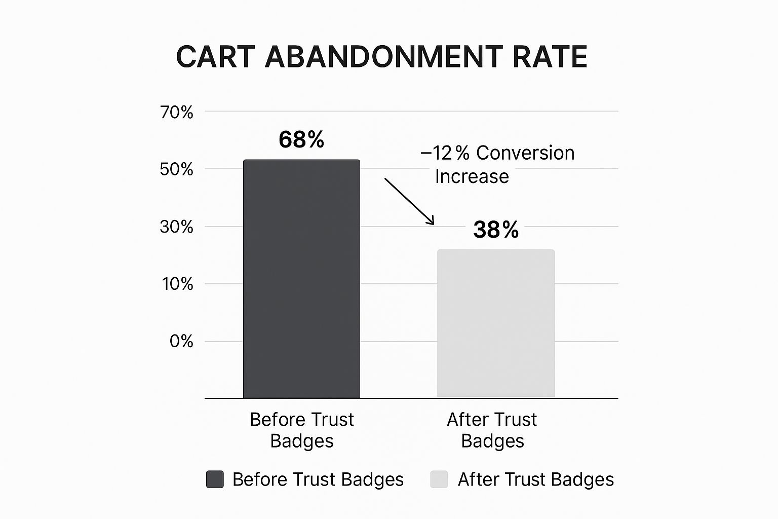
This shows a clear drop in abandonment when trust is established, a principle that applies directly to being transparent about your pricing.
Use Exit-Intent Popups to Make One Last Offer
Even with perfect transparency, some shoppers will still get cold feet. This is your last chance to win them back before they're gone for good. An exit-intent popup is a slick tool that detects when a user’s mouse is heading for the "close tab" or "back" button and triggers a final, timely offer.
This isn't about being annoying. It's about making a relevant offer to someone who has already shown they want to buy. A poorly timed popup is an interruption, but a well-timed one feels like a helpful nudge in the right direction.
For a shopper who's on the fence with a full cart, a small, compelling incentive can be all it takes to seal the deal. But which incentive should you use? It depends on your goal.
Comparing Incentive Strategies
This table breaks down some of the most common offers you can use in an exit-intent popup, helping you decide which one fits the situation best.
| Incentive Type | Primary Goal | Best For | Potential Drawback |
|---|---|---|---|
| Percentage Discount (e.g., 10% off) | Immediate conversion | First-time buyers, general appeal | Can devalue your brand if overused |
| Free Shipping | Eliminating the #1 cost concern | Carts just below the shipping threshold | Cuts into margins on low-value orders |
| Free Gift with Purchase | Increasing perceived value | Promoting a new or specific product | The gift may not appeal to all shoppers |
| Fixed Amount Off (e.g., $5 off) | Simple, clear value proposition | Lower-priced items where % seems small | Less impactful on high-value orders |
The key is to present an offer that solves a potential problem—like an unexpected cost—at the precise moment of hesitation. A simple, "Leaving so soon? Here's 10% off to complete your order," can recover a surprising number of otherwise lost sales, turning a near-miss into a win.
Win Back Shoppers with Smart Retargeting
An abandoned cart isn’t a lost sale—it's a warm lead. Think about it: a shopper has already told you exactly what they want. They’ve picked a product, added it to their cart, and gotten so close to buying. Your job now is to give them a gentle, helpful nudge back to the finish line without being pushy.
This is where a smart, automated follow-up funnel makes all the difference. By setting up a sequence of well-timed emails and targeted ads, you can recover a huge chunk of this otherwise lost revenue. The real key is to shift your mindset from "selling" to "helping," making every touchpoint feel like a timely reminder rather than a desperate plea.
The Proven Three-Part Email Sequence
Sending a single, generic "You left something in your cart!" email just doesn't cut it anymore. A multi-step sequence is far more effective because each email serves a distinct purpose, gradually building on the last to re-engage the customer.
And the data backs this up. Email remarketing is incredibly potent, with campaigns using a three-part sequence generating significantly more revenue. In fact, abandoned cart emails can hit open rates around 39%, which is almost unheard of for marketing messages. You can dig into more cart abandonment statistics to see the full picture.
This example from Klaviyo is a perfect illustration of a simple, clean reminder.
Notice the clear call-to-action, the big product image, and the direct, friendly language. It's not aggressive; it's a low-pressure way to help the customer pick up right where they left off.
Here’s a breakdown of a classic, high-converting sequence that I’ve seen work time and time again:
The Gentle Reminder (1-3 hours after abandonment)
- The Goal: Catch the customer while the purchase is still fresh in their mind. Life happens—they might have gotten distracted by a phone call or had a website glitch.
- The Vibe: Helpful and casual.
- The Content: Keep it simple. A subject line like "Did you forget something?" or "Your cart is waiting for you" works great. Inside, show a large, clear image of the product they left behind and a single, bold button that links directly back to their pre-filled cart. Resist the urge to offer a discount here; it's too soon.
The Value-Add (24 hours later)
- The Goal: Tackle any potential hesitation. Maybe they’re on the fence about the product or comparing prices with competitors.
- The Vibe: Reassuring and confidence-building.
- The Content: This email needs to do more than just remind. Reiterate the product's value and sprinkle in some social proof. A powerful customer testimonial or a star rating can work wonders. You could also answer common questions or highlight your hassle-free return policy. If you feel an incentive is needed, a small carrot like free shipping is often more effective than a steep discount at this stage.
The Final Nudge (48-72 hours later)
- The Goal: Create a little urgency to prompt a final decision.
- The Vibe: Direct but still friendly.
- The Content: This is your last best shot. A subject line like "Your items are almost sold out" or "Last chance to claim your cart" can be surprisingly effective. If you haven't offered an incentive yet, now is the time to introduce a small, time-sensitive discount (e.g., "10% off for the next 24 hours"). This final push is often what it takes to convert shoppers who were just on the edge.
Remember, the whole point of this sequence is to be a helpful guide. Each email addresses a different potential roadblock—from simple distraction to price sensitivity—making it far more likely you'll hit on the right message for that specific person.
Expanding Your Reach with Retargeting Ads
Email is a powerhouse, but it's not your only tool. Retargeting ads on social media and search platforms are an incredibly effective way to stay top-of-mind after someone leaves your site.
These ads work by showing the exact products a shopper left in their cart as they browse other places online, like Facebook, Instagram, or Google. Imagine someone abandons a pair of running shoes on your site, and an hour later, an ad for those exact shoes pops up in their Instagram feed. It’s hyper-personalized and jogs their memory, reigniting that initial interest.
Best Practices for Retargeting Ads:
- Use Dynamic Ads: Set up dynamic product ads that automatically pull images and details from the abandoned cart. This is non-negotiable for ensuring your ads are always relevant.
- Segment Your Audience: Don't blast the same ad to everyone. Create different campaigns for high-value carts versus low-value carts, or for first-time visitors versus loyal returning customers.
- Control the Frequency: Bombarding someone with ads is the fastest way to annoy them and damage your brand. Set a frequency cap so you're not showing the same person an ad a dozen times a day.
- Test Your Ad Copy: Don't just set it and forget it. Experiment with different messages. One ad could highlight a killer feature, another could mention free shipping, and a third could showcase a glowing customer review.
By combining a smart email sequence with well-aimed retargeting ads, you create a comprehensive system that works to recover sales without feeling creepy or intrusive. It’s all about turning that abandoned cart from a dead end into a second chance.
Your Cart Abandonment Questions, Answered
Even when you've got a game plan, cart abandonment can throw some curveballs. It’s a messy, complex part of ecommerce, and sometimes you just need a straight answer to a tricky question. I've heard them all over the years, so I’ve gathered the most common ones here to clear up the confusion.
Think of this as your personal FAQ for plugging the leaks in your checkout funnel. We'll get into the nitty-gritty, practical questions that pop up once you start digging in.
What's a Good Cart Abandonment Rate, Really?
You’ll see the industry average floating around 70%, which is frankly a terrifying number. But trying to hit a universal "good" rate is like chasing a ghost. A better question is, what's a good rate for you?
Someone selling high-end furniture is naturally going to see more abandoned carts than a shop selling quirky socks. The consideration phase is just longer. So, forget the industry average for a moment and benchmark against yourself. If you're at 75% today, chipping that down to 70% in the next quarter is a huge win.
The goal isn't to hit some magic number. It's about constant, steady improvement. Shaving off just 5% from your abandonment rate can have a massive impact on your revenue, and that’s a target worth fighting for.
How Often Should I Be Sending Abandoned Cart Emails?
This is where so many stores get it wrong. Too aggressive, and you come off as desperate. Too passive, and you’re just leaving cash on the table. From what I’ve seen work time and time again, the three-email sequence is the sweet spot.
Here’s a quick breakdown of the timing that works best:
- The First Reminder: Get this out within 1 to 3 hours. This is your best shot at catching someone who got pulled away by a phone call or a crying baby. It’s a simple, helpful nudge.
- The Second Nudge: Send this one about 24 hours later. It gives the person a little time to sleep on it and reminds them what they were so close to buying.
- The Final Offer: Hold off for 48 to 72 hours. This is your last chance to reel them back in, usually with a little extra incentive to create some urgency.
Pushing past three emails in a single week almost always does more harm than good. You risk annoying potential customers and racking up unsubscribes.
Do I Have to Offer Discounts to Get People Back?
Discounts are a powerful tool, but they're also a double-edged sword. Use them too often, and you’ll condition your customers to never pay full price. That's a dangerous game that can seriously erode your margins.
My advice? Hold your discount for the last possible moment. Your first abandoned cart email should never include an offer. Save that ace for your third and final email.
A simple, time-sensitive offer like "Take 10% off in the next 24 hours" often provides just enough push to get a hesitant buyer over the finish line. And don't forget the power of free shipping! Since unexpected shipping costs are the #1 killer of conversions, waiving that fee can be even more persuasive than a percentage off.
Aren't Popups Just Annoying? Will They Hurt My Brand?
I get this question all the time, and it’s a fair point. A bad popup is like a pushy salesperson—intrusive, annoying, and a total turn-off. But a smart popup? That's a different story entirely.
The secret is exit-intent technology. These popups only trigger when a visitor’s cursor moves towards the back button or browser tab, signaling they're about to leave. You're not interrupting their shopping; you're making one final, helpful offer before they walk out the door.
To make sure your popups help rather than hurt, stick to these ground rules:
- Offer Real Value: Give them a good reason to stay, like a small discount or a free shipping code.
- Stay On-Brand: The design should look and feel like the rest of your site—clean and professional.
- Provide an Easy Out: A clear and obvious "X" or "No, thanks" button is non-negotiable. Don't hold them hostage.
When done right, an exit-intent popup feels less like a spammy ad and more like a helpful store clerk asking, "Are you sure you found everything you were looking for?"
Ready to stop guessing where your store is losing money? The strategies in this guide are a great start, but identifying the exact friction points on your unique site can be tough. EcomHint uses AI to analyze your store against over 40 critical conversion factors, giving you a prioritized list of fixes to boost your sales instantly. Get your free store analysis today at EcomHint.
FREE STORE AUDIT
Ready to Apply These Tips? Get started now!
No email required • No credit card • Takes 5-8 minutes