
Your Guide to a Powerful Audit UX Design
A UX design audit is a deep-dive, systematic inspection of your e-commerce site that goes beyond aesthetics to uncover hidden friction points costing you sales.
Why Your E-Commerce Site Is Losing Money
Let's be blunt: a clunky website experience is a silent revenue killer. You can have fantastic products and a brilliant marketing strategy, but if customers get frustrated and bail before they buy, all that effort goes down the drain. This isn't just about making things look nice; in today's crowded market, it's about survival. A thorough UX design audit is the tool that lets you diagnose these invisible problems.
It's essentially a health check for your online store. Instead of just running through a generic checklist, it's a strategic investigation into how real people actually interact with your site. It starts to answer the critical questions that your standard analytics reports often can't.
Uncovering Hidden Friction Points
Customers abandon their carts for all sorts of reasons, but a poor user experience is one of the biggest culprits. An audit helps you pinpoint exactly where people are dropping off and, more importantly, why. Maybe it’s a confusing checkout form. Or a search bar that's impossible to find. Or maybe your product images just don't load properly on a phone.
These seemingly small issues compound, creating an experience full of friction. Without an audit, you're just guessing what's wrong. A structured UX review gives you the evidence you need to stop guessing and start fixing the specific things that are turning potential customers away.
A great user experience isn't a luxury anymore; it's a core business requirement. An audit provides the blueprint for creating an environment where customers don't just visit—they convert and come back for more.
The financial stakes here are huge. The global User Experience (UX) services market was valued at around $2.59 billion back in 2022 and is expected to rocket to an incredible $32.95 billion by 2030. This explosive growth shows just how seriously businesses are taking UX as a driver of real revenue. You can find more insights about this growing market focus on UX design to see where the industry is heading.
A Framework for Strategic Growth
A proper UX audit does more than just hand you a list of problems. It gives you a framework for smart, sustainable growth. Once you truly understand user behavior and their pain points, you can make informed decisions that serve both your customers' needs and your business goals. This guide will give you a clear, actionable framework to turn what you find in your audit into tangible improvements.
We’ll walk through the essential pillars of a successful e-commerce UX audit, treating it not as a technical chore, but as the vital business investment it truly is.
Before we dive in, let’s get a high-level view of what we’ll be examining. This table outlines the core components of a comprehensive e-commerce UX audit.
Key Focus Areas of a UX Design Audit
| Audit Area | Primary Goal | Common Issues to Look For |
|---|---|---|
| Usability & Heuristics | Ensure the site is intuitive and easy to use. | Inconsistent navigation, confusing calls-to-action, poor error messages. |
| User Journey Analysis | Identify and remove obstacles in key conversion paths. | Complicated checkout flows, difficult product discovery, forced account creation. |
| Accessibility | Make the site usable for people with disabilities. | Lack of alt text, poor color contrast, keyboard navigation issues. |
| Mobile Experience | Optimize for a seamless experience on all devices. | Unresponsive design, tiny touch targets, slow loading times on mobile. |
Each of these areas represents a critical piece of the customer experience puzzle. In the sections that follow, we'll break down how to tackle each one.
Laying the Groundwork for a Powerful Audit
Jumping into a UX audit without a plan is like trying to navigate a new city without a map—you'll end up wandering aimlessly, wasting time, and missing all the important spots. Before you start dissecting a single webpage, you need to lay a solid foundation. Think of this as your pre-flight checklist; it ensures your efforts are laser-focused and, ultimately, successful.
A scattered approach just leads to scattered results. The very first thing to do is anchor the entire audit in clear, measurable business objectives. What are you really trying to accomplish? A vague goal like "make the site better" is useless. You have to get specific.
Nail Down Your Business Goals
Start by thinking in terms of real-world outcomes that hit the bottom line. These goals will be your North Star, guiding every decision you make throughout the audit.
For an e-commerce store, your goals might look something like this:
- Slash the cart abandonment rate by 15% in the next quarter.
- Boost the mobile conversion rate by 10% by streamlining the checkout process.
- Make products easier to find by reducing the average number of clicks it takes to get from the homepage to a product page.
- Increase newsletter sign-ups by 20% by making the call-to-action more prominent and compelling.
Having sharp, specific targets like these turns your audit from a simple design review into a strategic business project. When every recommendation you make ties directly back to one of these core objectives, getting buy-in from stakeholders becomes infinitely easier.
Get Your Hands on the Right Data
With your goals set, it's time to dig into the data—both quantitative and qualitative—that will tell you where the real problems are. Don't get distracted by vanity metrics. You need to dive into reports that show how people are actually behaving on your site. For this, tools like Google Analytics and Hotjar are your best friends.
The most insightful audits are built on a foundation of both numbers and human stories. Analytics tell you what is happening, while user behavior tools show you why.
To start painting a clear picture of your current user experience, pull these specific reports:
- User Flow/Behavior Flow Reports (Google Analytics): These charts are fantastic for visualizing the paths people take through your site. Keep an eye out for strange drop-offs or loops where users seem to get stuck in a frustrating cycle.
- Heatmaps (Hotjar, Crazy Egg): Heatmaps give you a visual snapshot of where users are clicking, scrolling, and moving their mouse. They're brilliant for spotting "rage clicks" on elements that aren't actually clickable or noticing when users completely ignore a key call-to-action button.
- Session Recordings (Hotjar): This is where it gets really interesting. Watching anonymized recordings of real user sessions is the closest you can get to standing over someone's shoulder as they browse. You'll see their genuine struggles and moments of confusion firsthand.
By analyzing this data upfront, you can start forming solid hypotheses about where the friction points are, which you can then investigate more deeply.
Get Inside Your Users' Heads
An audit is fundamentally flawed if you don't have a deep, empathetic understanding of your target audience. You absolutely must look at your website through their eyes, not the eyes of your internal team. This is where user personas and journey maps become invaluable.
A user persona is a semi-fictional character that represents your ideal customer, fleshed out with their own goals, motivations, and frustrations. For an online store, you might create "Bargain Hunter Brenda," who is highly price-sensitive, or "Last-Minute Shopper Liam," who cares most about fast shipping.
Once you have your key personas, map out their typical user journeys for critical tasks, like finding a specific item or checking out. This exercise forces you to walk in their shoes and helps you spot roadblocks you might otherwise never notice. By grounding your audit UX design process in real user needs, your findings will be far more relevant and impactful.
Uncovering Usability Issues Like a Pro
Alright, you've got your goals mapped out and the data is rolling in. Now comes the fun part: the real investigation. This is where we shift from looking at high-level analytics to getting our hands dirty in the user interface, digging for those specific snags and pain points that are frustrating your customers.
We're going to dive into two of the most powerful techniques in any UX auditor's toolkit: heuristic evaluation and usability testing. These aren't just academic buzzwords; they're practical methods for seeing your site from two critical perspectives.
First, the heuristic evaluation lets you put on your expert hat and systematically check your site against proven design principles. Then, usability testing flips the script entirely, letting you see your store through the fresh, unbiased eyes of your actual users. Using both gives you a rock-solid, evidence-based foundation to build on.

Putting Your Site to the Test with Heuristics
A "heuristic evaluation" sounds way more complicated than it is. Think of it as a structured walkthrough of your site, using a set of established usability principles as your checklist. The most famous of these are Jakob Nielsen's 10 Usability Heuristics, which have been the gold standard for decades. They aren’t strict rules, but more like guiding principles for creating digital experiences that just feel right.
Let's translate a few of these into real-world e-commerce scenarios you can check for right now.
- Visibility of System Status: This is all about keeping your users in the loop. When a customer adds an item to their cart, do they get clear, immediate feedback? A subtle animation of the item flying to the cart icon, which then updates with a new number, is a perfect example. Another classic is an order tracking page that visually shows stages like "Order Confirmed," "Processing," "Shipped," and "Delivered."
- User Control and Freedom: People need a clearly marked "emergency exit." A common mistake I see is trapping a user in the checkout process without an easy way to go back and edit their cart. Can they easily change quantities, remove items, or jump back to shopping without losing everything they've done?
- Consistency and Standards: Your customers shouldn't have to play detective. For instance, is your main "Shop Now" button always the same color and shape across the entire site? This kind of consistency builds familiarity and reduces mental effort, making the whole shopping experience feel effortless.
A heuristic evaluation is your first line of defense. It’s a fast, cost-effective way to catch a surprising number of common usability blunders before you even involve real users.
Getting Hands-On with Usability Testing
While a heuristic review is invaluable, there is absolutely no substitute for watching real people try to use your website. Usability testing is where you bring in people who represent your actual customers, give them specific tasks to complete, and simply observe where they get stuck. This isn't about asking if they like your design; it's about seeing if they can use it.
The good news? You don't need a fancy lab or a massive budget. Simple, remote usability testing tools like Maze or UserTesting make this completely accessible for just about any business.
Finding the Right People to Test
Your insights are only as good as your participants. Please resist the urge to just ask your friends, family, or coworkers. They already know too much about your business and probably aren't your target audience anyway.
Instead, you need to find people who genuinely match your user personas. If you sell high-end camping gear, you need to test with people who actually go camping. You can find these users through a few different channels:
- Your existing customer list: Offer a small gift card or a discount in exchange for 20-30 minutes of their time.
- Social media groups: Find communities related to your niche (e.g., Facebook groups for hikers) and recruit from there.
- Recruiting platforms: Services built right into many testing tools can find participants for you based on specific demographic criteria.
Writing Test Scripts That Uncover the Truth
A good test script doesn't lead the user down a specific path. You're trying to create realistic scenarios, not give step-by-step instructions.
- A bad script: "Go to the search bar, type in 'red running shoes,' and click the first result."
- A good script: "Imagine you're training for a 5k and need new running shoes. Starting from the homepage, show me how you would find a pair you'd like to buy."
This open-ended approach reveals their natural thought process, showing you whether your navigation and search functions are actually intuitive.
Once you gather these insights, they get passed to the teams who can make the changes. A recent global survey found that 63% of companies assign this responsibility to their product teams, while 58% involve UX design teams, suggesting a shared ownership model is common. Interestingly, only 19% have a dedicated UX implementation team, highlighting a big shift in how companies are structured. You can explore more about how companies structure their UX teams in the full report.
Analyzing Critical E-Commerce User Journeys
A great user experience isn't about having a collection of pretty pages; it's about creating a smooth, intuitive journey for your customers. To really dig in and conduct a proper UX audit, you have to stop looking at individual elements in a vacuum. Instead, you need to trace the complete paths customers take, from the moment they land on your site to the final thank you page. These user journeys are where sales are made—or lost.
Let's walk through the most critical flows of any e-commerce store and pinpoint the common friction points that trip people up. By putting yourself in your customer’s shoes, you’ll uncover frustrating roadblocks that raw analytics data often fails to show.
The First Impression: Homepage and Navigation
Think of your homepage as your digital storefront. Its main job is to welcome visitors, tell them what you're all about, and point them in the right direction. Can a brand-new visitor figure out what you sell in five seconds flat? If not, you’ve already got a problem.
Your navigation is the map that guides them through the store. A cluttered or confusing menu is a surefire way to send potential customers bouncing right back to Google. People expect certain conventions, like a logo that clicks back to the homepage and a search bar that's easy to spot. When you stray too far from these established norms, you create unnecessary work for the user, forcing them to learn your unique system just to look around.
Finding the Goods: Product Discovery and Search
Once a customer has their bearings, they need to find what they're looking for. This is where the product discovery journey kicks off, and it's a make-or-break moment. A huge part of this is your search functionality.
A solid search experience absolutely must include:
- Autocomplete suggestions: This simple feature helps people find things faster and avoids frustrating typos.
- A plan for "zero results": What happens when someone misspells a word? A dead-end "no results" page is a conversion killer. Your site should be smart enough to suggest alternatives or show related products.
- Powerful filtering and sorting: Once they're on a category page, can they easily narrow down the options? Filters for size, color, price, and customer ratings are non-negotiable for most stores.
Think of your search bar as your most helpful salesperson. If it's slow, unhelpful, or can't understand what the customer is asking for, that customer will simply walk out the door.
This part of the journey is also incredibly visual. You have to remember that 38% of users will abandon a website if the layout is unattractive or confusing. You can find more UX statistics and trends that really drive home how much a clean interface matters.
The Make-or-Break Moment: The Product Detail Page
After a user clicks on a product, they land on the Product Detail Page (PDP). This is where the real decision-making happens. Every single element on this page needs to work together to build confidence and answer any questions a customer might have.
Here’s what to look for:
- High-quality images: Are there plenty of high-resolution photos from different angles? Can users zoom in and see the details?
- Persuasive product descriptions: The copy should do more than just list features. It needs to sell the benefits and help the customer imagine themselves using the product.
- Crystal-clear pricing and availability: No one likes ambiguity. The cost and stock status should be impossible to misinterpret.
- Social proof: Customer reviews, star ratings, and even photos from other buyers are incredibly powerful tools for building trust.
- An unmissable Call-to-Action (CTA): The 'Add to Cart' button needs to pop. Its color, size, and placement are critical for driving action.
This is a great point in the audit to start categorizing the issues you find. A simple visual can help organize your thoughts on how to tackle them.
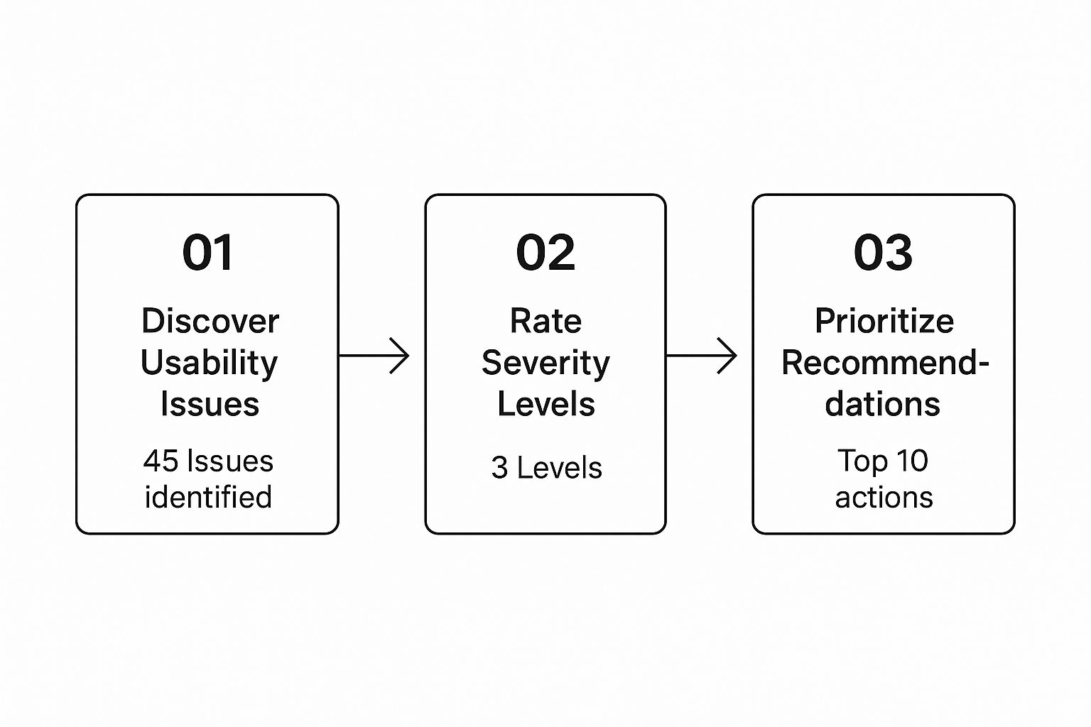
The idea is to funnel all your findings into a system that helps you identify and prioritize what to fix first, turning a long list of problems into a clear action plan.
Once you've identified several issues, a priority matrix is an excellent way to decide what to tackle first. This simple framework helps you weigh how much an issue impacts the user against how hard it is to actually implement a fix.
UX Audit Priority Matrix
| Issue Found (Example) | User Impact (Low/Medium/High) | Implementation Effort (Low/Medium/High) | Priority Score |
|---|---|---|---|
| "Add to Cart" button is below the fold on mobile | High | Low | High Priority |
| Product images are low resolution and not zoomable | High | Medium | High Priority |
| No guest checkout option available | High | High | Medium Priority |
| Footer links are disorganized | Low | Low | Low Priority |
By plotting your findings on a matrix like this, you can quickly spot the "quick wins"—those high-impact, low-effort fixes—and develop a logical roadmap for the more complex changes.
Navigating the Treacherous Checkout Funnel
The checkout is the final, and most fragile, part of the entire user journey. It’s where an astonishing number of sales are abandoned. Your one and only goal here should be to remove every ounce of friction and make paying you as fast and easy as possible.
Common roadblocks to look for in your audit include:
- Forced account creation: Don't do it. Many people will leave if you force them to create an account. A guest checkout option is an absolute must.
- Surprise shipping costs: This is the #1 reason for cart abandonment. Be upfront about all costs as early as you can.
- Long, complicated forms: Only ask for what you absolutely need to fulfill the order. Use tools like address autofill to make life easier.
- A clunky mobile experience: Trying to fill out complex forms on a tiny screen is a nightmare. Since 80% of users say it's easier to buy from mobile-optimized sites, a bad mobile checkout is just throwing money away.
Every single step in your checkout, from the cart page to the final confirmation, needs to be scrutinized for clarity, simplicity, and speed. A smooth checkout process directly translates to more money in the bank.
Turning Your Findings into an Actionable Report
You've done the deep dive. You've waded through user feedback, pored over heatmaps, and pinpointed a dozen friction points on the site. But here's the hard truth: all that insight is worthless if it just gathers dust in a forgotten folder. The most crucial part of any UX audit is translating your raw data into a compelling, easy-to-digest report that stakeholders will actually read—and more importantly, act on.

Forget about creating some dense, academic document. Your real job here is to build a persuasive business case for change. You need to tell a clear story, backed by solid evidence, that directly connects every suggested fix to a tangible business outcome, whether that's boosting conversions or shoring up customer loyalty. This report is your primary weapon for turning analysis into real-world improvements.
Structuring the Report for Maximum Impact
A well-organized report doesn't just dump information; it guides your audience. It should lead stakeholders from the 30,000-foot view right down to the nitty-gritty details, all while respecting their limited time.
Here’s a structure I've found to be incredibly effective:
- The Executive Summary: Think of this as the one-page memo. It's often the only part a busy executive will read, so it has to punch hard. State the audit's main goals, highlight the top 3-5 most critical findings, and summarize the business impact of your proposed changes.
- Methodology Overview: In a few quick sentences, explain how you got your results. Did you run usability tests with five users? A heuristic evaluation? Maybe you analyzed session recordings? This builds trust and shows your findings are grounded in a real process, not just your opinion.
- Key Findings & Recommendations: This is the heart of your report. For every issue you've uncovered, you need to present it clearly, visually, and persuasively.
Your report shouldn't be a laundry list of problems. It needs to be a roadmap to solutions. Frame every single recommendation as a data-backed growth opportunity, not just a criticism of what's currently there.
Bringing Your Findings to Life
To make your findings stick, you have to do more than just point out what’s broken. You need to show the problem, not just tell them about it. This is where you connect the dots between a specific design flaw and the pain it's causing both the user and the business.
For each finding, make sure you include these four things:
- The Issue: A simple, clear description of the problem. (e.g., "The 'Add to Cart' button is barely visible on mobile product pages.")
- The Evidence: Back it up with cold, hard proof. This is where you drop in annotated screenshots, short video clips from user tests, or a heatmap that shows a dead zone where clicks should be.
- The Impact: Explain why this matters in business terms. Always tie it back to your initial goals. (e.g., "This is a likely contributor to our high mobile bounce rate and poor add-to-cart conversion on mobile.")
- The Recommendation: Give them a specific, actionable fix. (e.g., "Change the button color to our high-contrast brand orange and increase its size to span the full width of the screen.")
Prioritizing Fixes with a Severity Rating
Let's be realistic: not all UX issues are created equal. A typo in the footer is an annoyance; a broken checkout button is a five-alarm fire. To help your team focus on what really matters, use a simple severity rating system for every finding.
This gives stakeholders an instant understanding of where to direct their resources first.
| Severity Level | Description | Example |
|---|---|---|
| High | A "showstopper." Prevents users from completing a critical task. | A user literally cannot complete their purchase due to a form error. |
| Medium | Causes significant frustration but might have a workaround. | The product filtering system is confusing and returns weird results. |
| Low | A minor annoyance that doesn't block task completion. | Inconsistent icon styles are used across different category pages. |
This simple framework does more than just organize your findings. It transforms a daunting list of fixes into a prioritized action plan. Suddenly, the development and design teams know exactly where to start to get the biggest wins, making the entire audit UX design process a powerful driver of immediate, positive change.
Answering Your Top UX Audit Questions
Even with a solid process in hand, a few questions always seem to come up before diving into a UX audit. Let's clear the air on some of the most common ones so you can get started with confidence.
How Often Should I Run a UX Audit?
There’s no magic number here, but I generally advise clients to plan for a full, comprehensive audit at least once a year. Think of it as an annual physical for your online store—a chance to check on its overall health. It's also non-negotiable before kicking off a major redesign. You wouldn't build a new house on a shaky foundation, right?
Beyond that big annual review, I'm a huge fan of smaller, more focused audits. You could spend one quarter digging into nothing but your checkout flow, then shift focus to the mobile product discovery experience the next. This keeps things manageable and promotes continuous improvement.
If you suddenly see your conversion rate tank or cart abandonment numbers spike for no apparent reason, that’s your cue. An immediate, targeted UX design audit is the fastest way to figure out what’s broken.
What Are the Most Common UX Mistakes You See on E-commerce Sites?
I've seen it all, but a few classic blunders pop up again and again. The number one offender, without a doubt, is a long and convoluted checkout process. If you make it difficult for people to give you their money, a surprising number of them just... won't.
Here are a few other repeat offenders I regularly flag:
- A neglected mobile experience: On mobile, tiny buttons, unreadable text, and pages that don't adapt to the screen are absolute conversion killers.
- Confusing navigation: When a customer can't find what they're looking for in a couple of clicks, they don't keep digging—they just assume you don't sell it and leave.
- Poor product imagery: Your photos have to do the heavy lifting since shoppers can't touch the products. Grainy, single-angle shots won't cut it.
- Hidden costs: Nothing erodes trust faster than springing a high shipping fee on a customer at the very last second. It’s a guaranteed way to lose a sale.
And one more thing: a lack of social proof. In 2024, if a store has no customer reviews or ratings, it just feels sketchy. Shoppers hesitate, and that hesitation often costs you the sale.
Can I Do This Myself, or Should I Hire an Expert?
Honestly, you can absolutely get tremendous value from doing a UX audit yourself, especially if you follow a structured guide like this one. A DIY audit is perfect for identifying the "low-hanging fruit"—those glaring issues you can fix right away. It's also a fantastic exercise for getting your whole team to think more about the user experience.
That said, bringing in a seasoned professional offers a fresh set of eyes that aren't biased by familiarity with your site. An expert has likely seen hundreds of stores, has access to sophisticated tools, and can spot subtle patterns you might overlook.
A hybrid approach often works best. Start with an internal audit to tackle the obvious problems and get a baseline. Then, consider bringing in an expert to validate what you've found and dig for those deeper, game-changing insights. It's the best of both worlds.
Stop guessing what's wrong with your store and start making data-driven improvements. EcomHint uses AI to analyze your e-commerce site, pinpointing critical issues that hurt sales and providing you with a clear, prioritized action plan. Get your free, instant analysis today at https://ecomhint.com.
FREE STORE AUDIT
Ready to Apply These Tips? Get started now!
No email required • No credit card • Takes 5-8 minutes